Page 1 of 1
First siggy ever...
Posted: Thu May 11, 2006 7:53 pm
by Foilin
ok lemme know what i need to change! (if any)

ok tear it down.
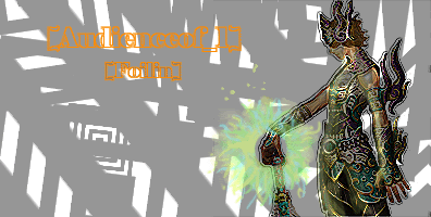
God Bless !
Posted: Fri May 12, 2006 12:28 pm
by Nannari
It's really not bad. Just add some different shades on the Grey, and mayb some shadowing..
I likes how you cut in the Image though, A little special
And yeah. I cant read that text at all

Posted: Tue May 16, 2006 5:53 am
by crawtona
try to make the both the char and text stand out more, id say take off the filter you have on the char, and use one of the darker colors from the char for the text. otherwise it looks pretty good, i like the background.
Posted: Tue May 16, 2006 6:18 pm
by Skitsefrenik
can always add more cowbell
Posted: Wed May 17, 2006 7:27 pm
by Foilin
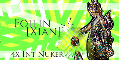
Ok wel thanks for all the crits
man im glad to see these forums back up! ok i re did it lemme have it

Posted: Sun May 21, 2006 2:23 pm
by antix
I think you should get more of a complicated background. The complicated render just looks completely out of place with the two-color background. I am sorry but I really do not like this. But, if you keep working at it you will be a PS master.
Posted: Mon May 22, 2006 4:15 pm
by Foilin
Alright! ty for the C&C i use the PS at work so i wont get to mess with it till later!
Posted: Wed May 24, 2006 7:56 pm
by Foilin
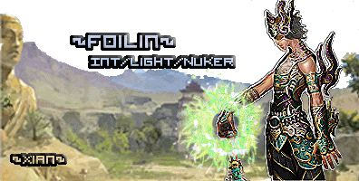
i like this one better, lemme know what yall are thinking!

Posted: Wed May 24, 2006 8:10 pm
by Nannari
That one is very nice.. Although i think its a little too high. But good job. try using another game render sometime?

Posted: Thu May 25, 2006 12:55 am
by Tatianasaphira
I don't think its the background, but more specifically what you did to that male char. Might want to try blending it a bit with lowering the opacity to 75%
As well the font doesnt' seem right. It is kind of distrasting from the overall pic, so maybe a placement of the two texts opposite each other, and perhaps changing the stroke to 1 so that its a small black around and not so thick. That might help
Now that I have nitpicked it apart, it is good...just needs some small tweeking
Posted: Thu May 25, 2006 4:01 am
by Bakemaster
I think the problem with this sig is that the effect you put on the background doesn't compliment the effect you put on the character. The background looks like an oil painting while the character looks tech-y.
Posted: Thu May 25, 2006 6:27 pm
by Foilin
lol i didnt put an effect on the BG anyways thanks.. time to tweak it
Posted: Thu May 25, 2006 9:47 pm
by Aya
yeah the background is one of the official BG... but have you tried to do the same effect on the char (i know there is a filter for that in PS....)