Digital art design, renderings, signatures and anything art related. Upload pictures of your newest work or ask for feedback. Post graphics requests or discuss art in general.
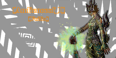
try to make the both the char and text stand out more, id say take off the filter you have on the char, and use one of the darker colors from the char for the text. otherwise it looks pretty good, i like the background.
Turvin -- lvl 16 Int hybrid -- Fable*Recruit Currently Farming, Sp so far: 10,700
I think you should get more of a complicated background. The complicated render just looks completely out of place with the two-color background. I am sorry but I really do not like this. But, if you keep working at it you will be a PS master.
I don't think its the background, but more specifically what you did to that male char. Might want to try blending it a bit with lowering the opacity to 75%
As well the font doesnt' seem right. It is kind of distrasting from the overall pic, so maybe a placement of the two texts opposite each other, and perhaps changing the stroke to 1 so that its a small black around and not so thick. That might help
Now that I have nitpicked it apart, it is good...just needs some small tweeking
I think the problem with this sig is that the effect you put on the background doesn't compliment the effect you put on the character. The background looks like an oil painting while the character looks tech-y.


