Digital art design, renderings, signatures and anything art related. Upload pictures of your newest work or ask for feedback. Post graphics requests or discuss art in general.
I like the style of 2 better, text on either needs work.
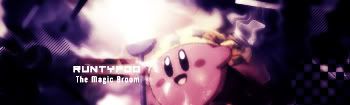
#1 looks like an amateur watercolor with a character on top of it
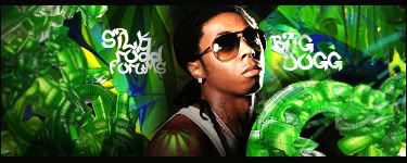
#2 has some originality, some decent colors.
#1 Seems as though the render/character is coming out of some mist or smoke.. it has an effect on my mind that the smoke is moving. i like it very much. Im not good with critisizing Text im horrible at it, but i dont mind it the yellow text above is quite small and almost invisible to a quick view... If i were to rate it i would give it a 9.5/10 ...
#2 seems Really bad to my eyes.. I look and i see Bad coloring and Just lines that shudnt be there... As you can see in my sig im not expert but im giving u an audience point of view and it looks crappy(That is #2). If i were to rate it i would give #2 a 5/10 For.. Effort I guess.
Cut, Copy, Paste, Art Kung Fu ^_^ ^^Thanks a Bunch to Cin^^