Page 1 of 1
fromHELL
Posted: Fri Sep 07, 2007 10:48 pm
by Peety
new taggy
Posted: Fri Sep 07, 2007 11:15 pm
by CrimsonNuker
7/10
Try putting the text closer to your focal
Posted: Fri Sep 07, 2007 11:19 pm
by Peety
3 points for text to far away?
=/
Posted: Fri Sep 07, 2007 11:20 pm
by CrimsonNuker
I rarely give out 10/10s lol
Hardly 9s too
Re: fromHELL
Posted: Fri Sep 07, 2007 11:38 pm
by iBilly
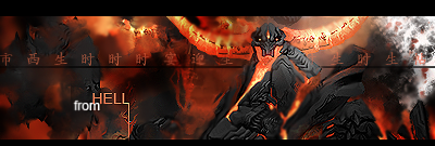
Peety wrote:new taggy
I think the text placement is fine.
I do however think the render was a poor choice, though I've no idea what the selection for 'minions of hell' is like these days. Some nice smudging, and the render, despite being poor, is blended well...
What's the white crap on the right?
7/10
Re: fromHELL
Posted: Fri Sep 07, 2007 11:40 pm
by CrimsonNuker
iBilly wrote:Peety wrote:new taggy
I think the text placement is fine.
I do however think the render was a poor choice, though I've no idea what the selection for 'minions of hell' is like these days. Some nice smudging, and the render, despite being poor, is blended well...
What's the white crap on the right?
7/10
Don't you keep looking back and forth from the text and render?
Re: fromHELL
Posted: Fri Sep 07, 2007 11:42 pm
by iBilly
CrimsonNuker wrote:iBilly wrote:Peety wrote:new taggy
I think the text placement is fine.
I do however think the render was a poor choice, though I've no idea what the selection for 'minions of hell' is like these days. Some nice smudging, and the render, despite being poor, is blended well...
What's the white crap on the right?
7/10
Don't you keep looking back and forth from the text and render?
The text doesn't draw my attention really, which is a good thing. The render is what my eyes focus on, even though I think the render chosen blows monkey pole.
Re: fromHELL
Posted: Fri Sep 07, 2007 11:43 pm
by BrokenSaint
CrimsonNuker wrote:iBilly wrote:Peety wrote:new taggy
I think the text placement is fine.
I do however think the render was a poor choice, though I've no idea what the selection for 'minions of hell' is like these days. Some nice smudging, and the render, despite being poor, is blended well...
What's the white crap on the right?
7/10
Don't you keep looking back and forth from the text and render?
Yeah +1. Too many distractions but I love the overall sig especially the background. I wanna know how you did that lol.
Posted: Sat Sep 08, 2007 12:43 am
by Peety
Basically blended renders sharpened and blurred caused the overall texture of the tag.
the backround was suppose to be a hand shopped skyline but it was too tedious so i just left one building with the smoke billowing out.
Posted: Sat Sep 08, 2007 1:15 am
by bladecarlo
nice sig..

Posted: Sat Sep 08, 2007 2:08 pm
by Luoma
when i joined srf that would probably have been a 10/10 xD
everyone is too good now >_>
i think the sig looks great, 8/10