Page 1 of 1
Another sprite~
Posted: Thu Sep 06, 2007 9:53 pm
by Snudge

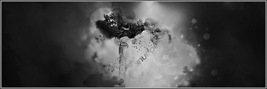
Thoughts? ^_^
Posted: Thu Sep 06, 2007 10:19 pm
by BrokenSaint
Cool. What is it...?
Posted: Thu Sep 06, 2007 10:21 pm
by Snudge
>.<"
Same dude as in the other sprite.

Posted: Thu Sep 06, 2007 11:08 pm
by Rizla
BrokenSaint wrote:Cool. What is it...?
+1 lol I have no idea what Im looking at.
Posted: Thu Sep 06, 2007 11:49 pm
by iBilly
Looks like macaroni and cheese with brown sauce slapped on top.
Not one of your better pieces.
Posted: Thu Sep 06, 2007 11:55 pm
by Snudge
iBilly wrote:Looks like macaroni and cheese with brown sauce slapped on top.
Not one of your better pieces.
...
...
Aight... oO
Posted: Fri Sep 07, 2007 12:33 am
by 0l3n
I CAN SEE IT!!!

Still not to good.... 6/10
Posted: Fri Sep 07, 2007 12:38 am
by Snudge
Replacement coming up. ^_^
Posted: Fri Sep 07, 2007 1:45 am
by aazumak
u guys r so wrong, i can so totally make out what it is, adn the coloring is good and so is text, the focal point could be bigger imo, but its nice 8/10
Posted: Fri Sep 07, 2007 3:50 am
by MasterKojito
7/10
Posted: Fri Sep 07, 2007 6:51 am
by nightbloom
No offense to any of you, but it always looks to me like 8/10 of you read the same PS tutorial on sigmaking. Dom's stuff is usually pretty original, 0l3n's too (even tho he seems to have given up on sig making).
Maybe cause I am a girl, I dont understand the artistic value of washed out, fuzzy squiggles, lines and cloudy bits over a pic.
Posted: Fri Sep 07, 2007 7:10 am
by hitokiri
nightbloom wrote:Maybe cause I am a girl, I dont understand the artistic value of washed out, fuzzy squiggles, lines and cloudy bits over a pic.
I agree. Except for the girl part.
Posted: Fri Sep 07, 2007 9:55 am
by iBilly
nightbloom wrote:No offense to any of you, but it always looks to me like 8/10 of you read the same PS tutorial on sigmaking. Dom's stuff is usually pretty original, 0l3n's too (even tho he seems to have given up on sig making).
Maybe cause I am a girl, I dont understand the artistic value of washed out, fuzzy squiggles, lines and cloudy bits over a pic.
It's the style I've picked up after a few months of working with Photoshop. I expand my style on occasion to fit styles best suited to LPs and other things branching off from sigs, but most of the time it can't be helped. It's how I've learnt.
aazumak wrote:u guys r so wrong, i can so totally make out what it is, adn the coloring is good and so is text, the focal point could be bigger imo, but its nice 8/10
We're not wrong, we just have a different opinion to you.
Posted: Fri Sep 07, 2007 11:08 am
by 0l3n
nightbloom wrote:No offense to any of you, but it always looks to me like 8/10 of you read the same PS tutorial on sigmaking. Dom's stuff is usually pretty original, 0l3n's too (even tho he seems to have given up on sig making).
Maybe cause I am a girl, I dont understand the artistic value of washed out, fuzzy squiggles, lines and cloudy bits over a pic.
Yeah, I get what you mean but I think its because you get some kind of inspiration by other sigs in here and end up doing something that looks allot like the sig you got your inspiration from..
That or its tutorials, thats why I try to make it without tutorials, to keep my own style.
P.S. Havn't given up at all.
Posted: Fri Sep 07, 2007 9:14 pm
by Meow
Rizla wrote:BrokenSaint wrote:Cool. What is it...?
+1 lol I have no idea what Im looking at.
+2
Im still learning how to make sprite sigs but it's not going so well lol :/
Posted: Fri Sep 07, 2007 11:18 pm
by CrimsonNuker
Black cat on nimbus ftw.
7/10