Page 1 of 1
NSR~Earthbound
Posted: Mon Sep 03, 2007 12:25 pm
by Snudge
Yay for overused images! ^-^
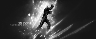
B&W1:

B&W2:
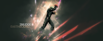
Colour1:
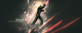
Colour2:
CnC please? ^^
Posted: Mon Sep 03, 2007 12:50 pm
by BrokenSaint
OMG. NICE! Hommagod!
10/10~
I love the Colour1 the best.

No suggestions for ya.

Posted: Mon Sep 03, 2007 1:42 pm
by iBilly
8/10
Very nice sprite tag, even if the actual sprite used has been around more than an 'actress' in Amsterdam.
I like the text placement too, Colour V1 is best.

Posted: Mon Sep 03, 2007 1:53 pm
by cin
8.5/10
i likes, but imo, the bottom "diagonal lines" shouldve been a little more
up, to get the feeling more that they are around the person
Posted: Mon Sep 03, 2007 2:02 pm
by Rizla
cin wrote:8.5/10
i likes, but imo, the bottom "diagonal lines" shouldve been a little more
up, to get the feeling more that they are around the person
to me it looked more as if he was raising the jagged surfaces out of the ground.
Posted: Mon Sep 03, 2007 2:05 pm
by cin
Rizla wrote:cin wrote:8.5/10
i likes, but imo, the bottom "diagonal lines" shouldve been a little more
up, to get the feeling more that they are around the person
to me it looked more as if he was
raising the jagged surfaces out of the ground.
explain please

i dont get it
Posted: Mon Sep 03, 2007 2:07 pm
by iBilly
The Earth cracking due to the sheer coolness of the sprite perhaps!

Posted: Mon Sep 03, 2007 2:29 pm
by Snudge

Another one, same style. Quickly added text because I don't feel like getting ripped. ^^
Posted: Mon Sep 03, 2007 2:39 pm
by iBilly
Sorry, don't like it that much.
Wolverine Sprite looks totally out of place dude, replace it with another that matches the colour & style.
Posted: Mon Sep 03, 2007 2:41 pm
by Snudge
Yeah, maybe I went a bit wild with the red's ^^'
Ah well, this was just another one to practice anyway
Posted: Mon Sep 03, 2007 2:57 pm
by Snudge

How's that? XD
Posted: Mon Sep 03, 2007 2:57 pm
by 0l3n
Like the c4d and the effect but I think it should be bigger and not in a ball.
Posted: Mon Sep 03, 2007 3:00 pm
by Snudge
I just put the mario in for fun
I'd never use anything that came out so LQ :p
Posted: Mon Sep 03, 2007 3:35 pm
by iBilly
Last image isn't displaying for me.
Posted: Mon Sep 03, 2007 5:56 pm
by CrimsonNuker
Coolness.
Colour 1 ftw. 8/10
Posted: Mon Sep 03, 2007 6:35 pm
by Dystopia
8/10
Good job, I just dont like the sprite itself xD, buts its a good sig
Posted: Mon Sep 03, 2007 10:41 pm
by deep.in
Black/white FTW

Posted: Tue Sep 04, 2007 7:15 pm
by CrimsonNuker
deep.in wrote:Black/white FTW
FTL!