Nature || simple sig
Posted: Wed Aug 29, 2007 7:33 am
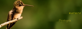
Well, this is my 1st shot at a simple/plain sig...

I didnt want to overdo anything, but also i didnt want to leave it too plain, Id thought id leave it without a boarder, any comments , suggestions please and how to improve this?

I didnt want to overdo anything, but also i didnt want to leave it too plain, Id thought id leave it without a boarder, any comments , suggestions please and how to improve this?