Page 1 of 1
LP/Small photomanip - Fallen Angel[Concept]
Posted: Wed Aug 22, 2007 9:46 pm
by Snudge
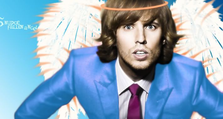
Just something I tried, with the[more or less] concept from my sig. This isn't fully finished yet either, but I just don't have enough skill to get the blue jacket around the hair nice and such and some other small stuff.
Posted: Wed Aug 22, 2007 10:07 pm
by iBilly
Reminds me of James Morrison.
Posted: Wed Aug 22, 2007 10:09 pm
by Snudge
iBilly wrote:Reminds me of James Morrison.
Yeah, before anyone else asks, I have no clue who this guy is, lol.
Posted: Wed Aug 22, 2007 10:10 pm
by _Banned
It's Napoleon duh!
Posted: Wed Aug 22, 2007 10:12 pm
by iBilly
James Morrison

Pretty sure it's him.
Posted: Thu Aug 23, 2007 12:14 am
by Rizla
really dislike your text, kerning is jacked up.
Posted: Thu Aug 23, 2007 12:15 am
by Knuckles
Err... What's with the text being half off the image? I really dislike it, and it isn't too great for a photomanip. even though you are starting off so I'll give you that.
Overall: 5.5/10
Not too great, but not horrible
Posted: Thu Aug 23, 2007 8:24 pm
by CrimsonNuker
Hes John Heder >_>
Napoleon Dynomite
Blades Of Glory..
Is his 5 o Clock shadow fake? lol
Posted: Thu Aug 23, 2007 9:51 pm
by Elikapeka
I like it, alot...actually.
Maybe it's because I adore John Heder, but to me the imperfections of it make it better. Love what you did with his jacket, has a cartoony feel for me, and sort of makes his head seem like a bobble head. It's fun to me, and I enjoy looking at it and smiling because it's goofy.
Don't want you to take offense to that, because I can't stop staring and getting put back in a good mood.

Sorry if you do take offense, though.