Page 1 of 1
NSR ~ Luigi
Posted: Mon Jul 09, 2007 11:14 pm
by TwelveEleven

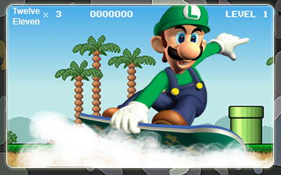
Some people might think it's a little too plain, anyways comments and -/5 please
Posted: Mon Jul 09, 2007 11:24 pm
by cin
a little too plain and too big imo..
and tbh it looks like just a cut out from a larger image with your txt on it oO
Posted: Mon Jul 09, 2007 11:56 pm
by Grim
Very true.
When something looks like that, I normally add a wierd effect, (I think you guys call it C4D or some crap like that) and add a grunge background with opacity way up to just break up the stillness.
Put a nice looking sun or something perhaps.
It's funny how Bluey got us all into Nintendo sigs..
Or atleast she did for me.
Posted: Tue Jul 10, 2007 12:28 am
by TwelveEleven
cin wrote:a little too plain and too big imo..
and tbh it looks like just a cut out from a larger image with your txt on it oO
I made it myself -.-' Anyways forgot to resize

@grim, I always create everything in a signature myself, so i'm gonna make a sun myself too. It's supposed to be plain, he's in the sky surfing clouds.. Other than renders of course
(And icons and such)
Edit: Ok resized it, needs a border though. Maybe a cloudish/airish/waterish effect for the text. Adding a sun to it.
Posted: Tue Jul 10, 2007 1:13 am
by TwelveEleven
3rd edition:
Posted: Tue Jul 10, 2007 1:23 am
by Ell
What's the gray thing around the sig?
Posted: Tue Jul 10, 2007 1:43 am
by TwelveEleven
A border
Posted: Tue Jul 10, 2007 3:34 am
by Grim
hahahaha, You'r a noob. You've got 0 points/coins. (Forgot what mario/luigi have to collect.
3rd edition sig rating: 9/10 Looks sweet. This has got to be one of the best Nintendo Sigs SRF has.
Posted: Tue Jul 10, 2007 7:33 am
by rek
The bg is alrigt but the clouds or w/e it is ruins it.
Posted: Tue Jul 10, 2007 7:48 am
by Rizla
I would like to see a bit more shading in those puffy clouds, and see what it look slike coming over the border...not sure if that would look good or not. I think your composition is v.nice.