Page 1 of 1
Rate my Sigs
Posted: Thu Jul 05, 2007 1:13 am
by the.dead.illusion
Re: Rate my Sigs
Posted: Thu Jul 05, 2007 1:15 am
by TwelveEleven
the.dead.illusion wrote:
4/10

4/10

4/10
1/10 Don't screw up 47!


3/10 Text doesn't fit in (The font type) And the animation is too fast..
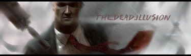
These were some of my old sigs i made like 2 months ago and last month but the last one is my recent one which i animated the text. so...rate them

Posted: Thu Jul 05, 2007 3:39 am
by pherball
lulz u ned halp on j0r sigz lul..
animation = fail
transformers = epic but not mega epic.
Posted: Thu Jul 05, 2007 4:50 am
by CrimsonNuker
on average 6.5/10
Posted: Thu Jul 05, 2007 5:06 am
by exality
u have a thing for only 2 sides of it with borders dont u?
Posted: Thu Jul 05, 2007 5:31 am
by rek
what? movie borders are cool..
Posted: Thu Jul 05, 2007 10:08 am
by BrokenSaint
Dude, the sigs are so dark. Try making it bright at the focal point. Honestly, It's an eyesore because of the darkness.
Posted: Thu Jul 05, 2007 11:45 am
by the.dead.illusion
ugh....ok ok, i know they're not good, but i just used them to test out some brushes and thought if u would rate them
Posted: Thu Jul 05, 2007 12:23 pm
by 0l3n
The optimus prime one looks cool.
The text is quite bad on the other ones