Page 1 of 1
NSR~ -/- (also help choosing which one)
Posted: Wed Jul 04, 2007 11:11 am
by runtypoo
 or
or
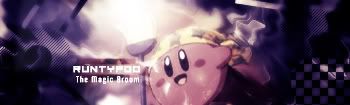
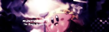
well basically haven't made a signature in a while
it is probably shit house but anyway.
Rate it and give me feedback:)
Posted: Wed Jul 04, 2007 11:14 am
by BrokenSaint
Top one is better. It has a stronger focal point. Superb job on the sig dude.
9/10
Posted: Wed Jul 04, 2007 2:04 pm
by rek
verrrry nice 8/10 but kirby looks a little flat.
Posted: Wed Jul 04, 2007 2:29 pm
by aazumak
reK wrote:verrrry nice 8/10 but kirby looks a little flat.
now that u mention it, he does.. u could probably sphereize hima bit, but i like em both, very hard to decide lol
i'm going to go with #1 for the same reasons mentioned above
i like it
Posted: Wed Jul 04, 2007 3:17 pm
by Grim
Top has More Color, and is really bright.
Bottom has less color, and less light.
I choose the top, because the color is really noticible, but if you decreased the light from the top, It would be great.
8/10