Page 1 of 1
NSR~BF 2142
Posted: Sun Jul 01, 2007 5:41 pm
by Grim
Please Rate it, Im trying to test some stuff I did in Gimp to make my sigs look better,

.
I tried to focus on the background more then the stock, and i noticed i screwed up on the "dividing line"
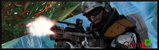
Stock used was Battlefield 2142
-/10 Please
Posted: Sun Jul 01, 2007 6:00 pm
by Ell
2/10

Background seems totally out of place, the extra dividing thing especially. It looks like you pasted a wallpaper and then slapped on a render. You should blend your render to make it fit more in the sig. The dividing line is pixelated, text is on edge, no flow, no lighting, kinda big. Colors don't really match, text is red while everything else is bluish. Uhh, I'm sure someone else more experienced with ps could keep going...
Posted: Sun Jul 01, 2007 6:10 pm
by Grim
O yeah, btw, please say anything that could make it better.
Or atleast state y you have given the score that you gave.
Ell: Alrigt thanks, Ill keep it in mind. I wish i had PS, it seems much eaiser to use