Nubcake Sig Maker

Digital art design, renderings, signatures and anything art related. Upload pictures of your newest work or ask for feedback. Post graphics requests or discuss art in general.
Post Reply
User avatar
Elikapeka
Active Member
Posts: 566
Joined: Sun Jun 24, 2007 4:18 am
Quick Reply: Yes
Location: Azteca

Nubcake Sig Maker

Post by Elikapeka »

Ahh, hello there. :) After a few years of having friends make sigs for me, and never totally liking the outcome, I had a revelation...make yer own ya lazy dolt! Hah, err.
I've been using GIMP to resize images, and manip with filters for awhile but was always intimidated by sigs, but it's summer and I'll melt if I go outside, so I browsed tha intarweb and have made two. :o Go me.
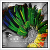
First;
Image
Made using Penguins Sig Tut
Second;
Image
Made using Full Grunge Singature Tut

Be brutally honest now, how'd I do? I can take an anal critics word. I think I'm liking the second better, because the first looks insanely busy and just not neat. Ah well. I'm off to muddle about. Enjoy!

User avatar
fena
Ex-Staff
Posts: 4441
Joined: Sun May 06, 2007 5:15 am
Quick Reply: Yes
Location: Life

Post by fena »

First of all, I'd like to say that I'm not much of an Artist, so don't take my opinions too seriously. Wait for Snudge or Rizla or someone to come, and they'll give you a honest and REAL opinion.

However, I'd still like to throw in my $0.02, if that's okay with you. :)
I like the first one more. I don't know why, but the text and the girl in the second one just seem quite out of place. I don't really like the colors that much either.
In the first one, I think you should make your name a little bit darker and heavier, so it's easier to read. I don't know if you were intentionally going for that style, but regardless if you were or not, I think it still could be darker.

Just my opinion. But like I said, wait for some real Artist to come and rate you. :)

For the first one, 6.5/10.
Second one, 4.5/10.

Good job for your first try, if I may say so, and good for you for learning how to make your own Sigs. :)

User avatar
Dystopia
Advanced Member
Posts: 2317
Joined: Thu Jan 04, 2007 8:37 pm
Quick Reply: Yes
Location: Off Topic

Post by Dystopia »

I like the 1st one, but what I dont get is why place your text over your focal, move it aside, make it visible, but smaller and AWAY from edges :)

The second I didnt like at all.
Its the empty space, the scanlines and the grunge theme didnt go with the girl....

But good for a first! Keep reading tuts keep it up!
Image

User avatar
BrokenSaint
Veteran Member
Posts: 3473
Joined: Sun Jan 01, 2006 8:49 pm
Quick Reply: Yes
Location: Stuntin'.
Contact:

Post by BrokenSaint »

+1 to Dystopia and FenaCorp

What you want to focus on is which part of your sigs does the eye naturally focus on? I'm not really liking the first one because of your text covering your focal. You should choose colors that match and not some randomly chosen rainbow. For the second one, lighter colors are recommended because of your focal. Again, which one does the eye automatically look at? The main attraction should be the focal and not the text. Oh and try to fill up those empty spaces.

But kudos to you for making your own. They aren't bad for a first timer. Once you get the hang of it, try making your own sig with different variations.

Since you just began,

5/10
6/10

Now, let's push you. :p

pherball
Valued Member
Posts: 398
Joined: Wed Jul 19, 2006 6:16 am
Quick Reply: Yes
Location: Xian

Post by pherball »

harder stronger faster..
daft punk ftw..
Image

Post Reply

Return to “Artists Corner”