Page 1 of 1
I made my own sig
Posted: Tue Jun 12, 2007 3:22 pm
by Apocalypse57
lol my first silkroad sig.. its not the best but heh

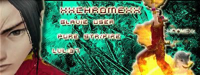
suicidegirl is still making me one this is just a noob creation by me

tell me what you think!
Posted: Tue Jun 12, 2007 4:52 pm
by Rizla
I think your color choices conflict greatly, you need a border, your selections are subpar, lay off the layer styles (lol), dont repeat your name, tighten your text. Overall, it's pretty bad.
Posted: Tue Jun 12, 2007 4:53 pm
by exality
TOO PIXELY!
not smooth at all really rough edges!
but good job otherwise it must of been a pain in the ass cutting thoes out
Keep tryin!
Posted: Tue Jun 12, 2007 5:38 pm
by Apocalypse57
mind posting any tips and tricks for making nice backrounds or making things work.. im new to photoshop soo i dont rlly know where things are and how to use em.
Posted: Tue Jun 12, 2007 6:07 pm
by Rizla
Posted: Tue Jun 12, 2007 6:37 pm
by Apocalypse57
here i made a new sig hope its better... too bad i didnt see the site you posted earlier..it could have helped me more.... n e way heres my second one. Let me know what u think.

Posted: Tue Jun 12, 2007 6:52 pm
by Snudge
Nooo! Not the outer glow!
Please, stop the outer glow. Even when you do apply an outer glow, change the color! I've seen this done so many times. xD
Posted: Tue Jun 12, 2007 6:54 pm
by Apocalypse57
u sayin tht cuz uve seen it soo many times or because its ugly

Posted: Tue Jun 12, 2007 6:55 pm
by Snudge
Apocalypse57 wrote:u sayin tht cuz uve seen it soo many times or because its ugly
Because it's ugly ^^ The standard color for outer glow is horrible
And it immediately shows you used outer glow, you don't always want that

Posted: Tue Jun 12, 2007 6:56 pm
by Rizla
yeah generally you want to avoid layer styles (outer glow) at all costs. If you want an outer glow, just brush the edges with a soft brush on a layer beneath the subject.
Posted: Tue Jun 12, 2007 7:00 pm
by Apocalypse57
kk thnx for advice, but overall is it better than the other one?
Posted: Tue Jun 12, 2007 7:04 pm
by SuicideGrl
as promised, here's the one you wanted :)
i left out most of the text because it looked SOO much better w/ just your name. hope you like it.
Posted: Tue Jun 12, 2007 7:06 pm
by Apocalypse57

WOW lol rlly nice! Thnx sooo much, its rlly appreciated.
love it love it
Posted: Tue Jun 12, 2007 7:10 pm
by SuicideGrl
Apocalypse57 wrote::shock: WOW lol rlly nice! Thnx sooo much, its rlly appreciated.
love it love it :wink:
good :) it was fun. i had to start over like 4x because either i hated what i did to it or i had weird text problems, but i learned a lot whiel i did it. new tricks ftw!
Posted: Tue Jun 12, 2007 7:25 pm
by Rizla
very nice render

get your text off the edges!
(pet peeve)
Posted: Tue Jun 12, 2007 7:37 pm
by SuicideGrl
Rizla wrote:very nice render :) get your text off the edges! :D (pet peeve)
i did this cool thing w/ the render... i moved the talismans to anothe rlayer, then i overlaid a gradient map from black to dark gray on the body, then erased everything but the shadows... you can rreally see ut on his arm, where the sleeve hangs over and casts a shadow on his arm, and where his hair shadows his face. it was hard because each tali glows and therefore is a light source, so i had to keep adjusting where the shadows would fall. i love the way it worked though.
Posted: Tue Jun 12, 2007 7:39 pm
by Snudge
That's some great work on the render, SG. Nice ^^
Posted: Tue Jun 12, 2007 7:44 pm
by Rizla
SuicideGrl wrote:Rizla wrote:very nice render
get your text off the edges!
(pet peeve)
because each tali glows and therefore is a light source,
You could really take it further too, more light wouldnt hurt on this one.
Posted: Tue Jun 12, 2007 7:49 pm
by SuicideGrl
Rizla wrote:SuicideGrl wrote:Rizla wrote:very nice render :) get your text off the edges! :D (pet peeve)
because each tali glows and therefore is a light source,
You could really take it further too, more light wouldnt hurt on this one.
i'm having problems with controlling light sources. it seems that in order to make light as bright as i want it to be, i always end up washing out things that i want to preserve. maybe i meed to figure out some new techniques.
Posted: Tue Jun 12, 2007 8:29 pm
by Shimohime
I didn't read all the comments, so I'm sry if I repeated.
Main thing: remove the bevel
Otherwise, not bad
Posted: Tue Jun 12, 2007 8:31 pm
by Rizla
SuicideGrl wrote:Rizla wrote:SuicideGrl wrote:Rizla wrote:very nice render
get your text off the edges!
(pet peeve)
because each tali glows and therefore is a light source,
You could really take it further too, more light wouldnt hurt on this one.
i'm having problems with controlling light sources. it seems that in order to make light as bright as i want it to be, i always end up washing out things that i want to preserve. maybe i meed to figure out some new techniques.
soft brushes and overlay/screen/linear dodge/color dodge layer blending modes are your friends when it comes to light.
Posted: Tue Jun 12, 2007 9:14 pm
by SuicideGrl
Rizla wrote:soft brushes and overlay/screen/linear dodge/color dodge layer blending modes are your friends when it comes to light.
the dodges still give me problems... but i have overlay and screen pretty dialed now i think. played around w/ color burn a bit too, but that's also hard to use.
Posted: Tue Jun 12, 2007 10:38 pm
by 0l3n
Try smudging the lighting with a soft brush, it makes it look more natural instead of just having a shiny white ball floating around.