Digital art design, renderings, signatures and anything art related. Upload pictures of your newest work or ask for feedback. Post graphics requests or discuss art in general.
I think your color choices conflict greatly, you need a border, your selections are subpar, lay off the layer styles (lol), dont repeat your name, tighten your text. Overall, it's pretty bad.
mind posting any tips and tricks for making nice backrounds or making things work.. im new to photoshop soo i dont rlly know where things are and how to use em.
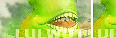
here i made a new sig hope its better... too bad i didnt see the site you posted earlier..it could have helped me more.... n e way heres my second one. Let me know what u think.
yeah generally you want to avoid layer styles (outer glow) at all costs. If you want an outer glow, just brush the edges with a soft brush on a layer beneath the subject.
good :) it was fun. i had to start over like 4x because either i hated what i did to it or i had weird text problems, but i learned a lot whiel i did it. new tricks ftw!
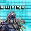
Rizla wrote:very nice render :) get your text off the edges! :D (pet peeve)
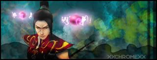
i did this cool thing w/ the render... i moved the talismans to anothe rlayer, then i overlaid a gradient map from black to dark gray on the body, then erased everything but the shadows... you can rreally see ut on his arm, where the sleeve hangs over and casts a shadow on his arm, and where his hair shadows his face. it was hard because each tali glows and therefore is a light source, so i had to keep adjusting where the shadows would fall. i love the way it worked though.
Rizla wrote:very nice render :) get your text off the edges! :D (pet peeve)
because each tali glows and therefore is a light source,
You could really take it further too, more light wouldnt hurt on this one.
i'm having problems with controlling light sources. it seems that in order to make light as bright as i want it to be, i always end up washing out things that i want to preserve. maybe i meed to figure out some new techniques.
Rizla wrote:very nice render get your text off the edges! (pet peeve)
because each tali glows and therefore is a light source,
You could really take it further too, more light wouldnt hurt on this one.
i'm having problems with controlling light sources. it seems that in order to make light as bright as i want it to be, i always end up washing out things that i want to preserve. maybe i meed to figure out some new techniques.
soft brushes and overlay/screen/linear dodge/color dodge layer blending modes are your friends when it comes to light.
Rizla wrote:soft brushes and overlay/screen/linear dodge/color dodge layer blending modes are your friends when it comes to light.
the dodges still give me problems... but i have overlay and screen pretty dialed now i think. played around w/ color burn a bit too, but that's also hard to use.


get your text off the edges!
(pet peeve)