Page 1 of 1
NSR~I'm gonna be sooo hated. :D
Posted: Wed Jun 06, 2007 3:25 pm
by Snudge
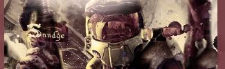
Because it's a Halo sig!

Hate me! Go on, you won't hurt me
Posted: Wed Jun 06, 2007 3:28 pm
by cin
looks good imo. and yes its another halo sig
i like the uneven border.. or was that an accident?

Posted: Wed Jun 06, 2007 3:29 pm
by Snudge
cin wrote:looks good imo. and yes its another halo sig
i like the uneven border.. or was that an accident?
xD No, it wasn't
I do think the right one is a bit broad, might change that later
Posted: Wed Jun 06, 2007 3:34 pm
by rek
sexay

but the lighting is a bit off 7/10
Posted: Wed Jun 06, 2007 3:35 pm
by Snudge
reK wrote:sexay
but the lighting is a bit off 7/10
The lightin at the top? What should be changed?

Posted: Wed Jun 06, 2007 3:36 pm
by 0l3n

Snudge the copy ninja!!
just kidding looks good
Posted: Wed Jun 06, 2007 3:47 pm
by rek
see the white bit to the right? darken that
Posted: Wed Jun 06, 2007 3:54 pm
by Snudge
Fix'd
Posted: Wed Jun 06, 2007 3:59 pm
by rek

i meant this bit
Posted: Wed Jun 06, 2007 4:02 pm
by Snudge
I know you do, and I did de-brightened it. >.> Maybe I shouldnt have smudged it as much
Posted: Wed Jun 06, 2007 4:06 pm
by Snudge
Ok, take 2:

Edit; Crap, sorry for Double Post. >_>

Posted: Wed Jun 06, 2007 7:18 pm
by CrimsonNuker
Looks good 7/10
Posted: Wed Jun 06, 2007 7:23 pm
by Snudge
-ignore.-
Didn't upload yet
Fix'd border and lighting, gonna try soe new fonts now.
Edit;
Final version!

And for the record, the initial sig;
Posted: Thu Jun 07, 2007 1:17 am
by pherball
What's with the dots?

Posted: Thu Jun 07, 2007 1:19 am
by shadowman20875
just get rid of the border, I think it'll look better w/o it. Borders are supposed to give it a 'finished' feeling, this one is just... there. Also, agree w/ above, y is there a big black dot?