Digital art design, renderings, signatures and anything art related. Upload pictures of your newest work or ask for feedback. Post graphics requests or discuss art in general.
Riggs
Common Member
Posts: 159 Joined: Mon May 07, 2007 8:13 amQuick Reply: YesLocation: Canada
Post
by Riggs Sat Jun 02, 2007 8:35 am
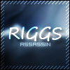
Made one featuring my favorite guitarist.
Comments and suggestions appreciated.
EDIT:
Text wasn't really to my liking, tried a different one.
Last edited by
Riggs on Sat Jun 02, 2007 10:00 am, edited 1 time in total.
cin
Post
by cin Sat Jun 02, 2007 8:37 am
tis cool.
i just dont really like the txt.
sig is good
Riggs
Common Member
Posts: 159 Joined: Mon May 07, 2007 8:13 amQuick Reply: YesLocation: Canada
Post
by Riggs Sat Jun 02, 2007 8:38 am
cin wrote: tis cool.
i just dont really like the txt.
sig is good
I don't like the text either
I'm terrible at it
cin
Post
by cin Sat Jun 02, 2007 8:41 am
Riggs wrote: cin wrote: tis cool.
i just dont really like the txt.
sig is good
I don't like the text either
I'm terrible at it
i normally go to
http://www.themeworld.com and check out the fonts.
over there, i normally find nice ones.. maybe give it a try.
but really thats the only thing i would change if i were you
good job.
Riggs
Common Member
Posts: 159 Joined: Mon May 07, 2007 8:13 amQuick Reply: YesLocation: Canada
Post
by Riggs Sat Jun 02, 2007 8:43 am
cin wrote: Riggs wrote: cin wrote: tis cool.
i just dont really like the txt.
sig is good
I don't like the text either
I'm terrible at it
i normally go to
http://www.themeworld.com and check out the fonts.
over there, i normally find nice ones.. maybe give it a try.
but really thats the only thing i would change if i were you
good job.
I'll work on it
I usually go to
http://www.dafont.com for my fonts
CrimsonNuker
Dom's Slut
Posts: 13791 Joined: Sun Aug 06, 2006 3:31 amQuick Reply: YesLocation: guildwars2
Post
by CrimsonNuker Sat Jun 02, 2007 2:51 pm
ur name should be bigger and with more appealing text
shadowman20875
Post
by shadowman20875 Sat Jun 02, 2007 3:29 pm
i like the art style, although imo i think the blurs are too regulated, if the middle smudges were accented i think it'd look better
harman443
Hi, I'm New Here
Posts: 21 Joined: Wed May 16, 2007 1:56 am
Post
by harman443 Sat Jun 02, 2007 4:24 pm
i don't like the colors.. sry but i like dark and light sigs not gold but if i did i would of copied it lol
pherball
Valued Member
Posts: 398 Joined: Wed Jul 19, 2006 6:16 amQuick Reply: YesLocation: Xian
Post
by pherball Sat Jun 02, 2007 4:25 pm
harman443 wrote: i don't like the colors.. sry but i like dark and light sigs not gold but if i did i would of copied it lol
... Look at your own sig. It's dark.
And BTW, saying if you liked it you would have copied it could probably get you hated around here.
Riggs
Common Member
Posts: 159 Joined: Mon May 07, 2007 8:13 amQuick Reply: YesLocation: Canada
Post
by Riggs Sat Jun 02, 2007 4:36 pm
Yeh I still gotta work on text. Should probably work on my smudging too, not exactly the greatest xD
CrimsonNuker
Dom's Slut
Posts: 13791 Joined: Sun Aug 06, 2006 3:31 amQuick Reply: YesLocation: guildwars2
Post
by CrimsonNuker Sat Jun 02, 2007 4:54 pm
pherball wrote: harman443 wrote: i don't like the colors.. sry but i like dark and light sigs not gold but if i did i would of copied it lol
... Look at your own sig. It's dark.
And BTW, saying if you liked it you would have copied it could probably get you hated around here.
makes me wonder if he ripped his sig lol


I'm terrible at it


