Page 1 of 1
New C&C3 sig :)
Posted: Sun May 20, 2007 12:14 am
by Sol

compliments and critism are welcome.
Posted: Sun May 20, 2007 12:40 am
by Snudge
I like it. Much.
Andlove the way you 'implemented' your nick.
9/10

Posted: Sun May 20, 2007 4:01 am
by MastaChiefX
yea pretty good
9/10
Posted: Sun May 20, 2007 8:57 am
by Artem
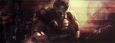
Is that a USSR logo?
If so 10/10 <3!!
edit:: your hammer is too high.
Posted: Sun May 20, 2007 9:07 am
by Sol
that ussr logo is from a Kirov airship which i used in the background ^_^
Posted: Sun May 20, 2007 9:09 am
by Artem
The height seems to be fine, but it should be the other way around ^^
edit:: Here

Posted: Sun May 20, 2007 12:53 pm
by ElCapuccino
Dang thats nice! :O
Didn't see such good text for a long time.
9/10
Posted: Mon May 21, 2007 12:28 am
by Sol
Artem wrote:The height seems to be fine, but it should be the other way around ^^
i know but it didn't fit the sig with the airship the otherway round to i used transform
ElCapuccino wrote:Dang thats nice! :O
Didn't see such good text for a long time.
9/10
thanks capu, yeh i decided that modest would be good. plus u can't go wrong with
80% opacity and a overlay layer then CTRL+J then change the filter to soft light.
Posted: Mon May 21, 2007 12:35 am
by HeavyDutyLagger
I thought I would see kane... lol
Posted: Mon May 21, 2007 7:46 am
by rek
very nice lighting and colours but i dont see the flow 8/10
Posted: Mon May 21, 2007 8:02 am
by cin
reK wrote:very nice lighting and colours but i dont see the flow 8/10
ummmm imo not all sigs need this "flow" you comment on in every sig rating
Posted: Mon May 21, 2007 8:54 am
by rek
lol....flow is direction.....
Posted: Mon May 21, 2007 9:00 am
by cin
reK wrote:lol....flow is direction.....
i know lol. but your last halo sig didnt have any direction either
direction could mess it up.
Posted: Mon May 21, 2007 12:52 pm
by ElCapuccino
Sol wrote:Artem wrote:The height seems to be fine, but it should be the other way around ^^
i know but it didn't fit the sig with the airship the otherway round to i used transform
ElCapuccino wrote:Dang thats nice! :O
Didn't see such good text for a long time.
9/10
thanks capu, yeh i decided that modest would be good. plus u can't go wrong with
80% opacity and a overlay layer then CTRL+J then change the filter to soft light.
wow...
You're an inspiration to us all...
Posted: Mon May 21, 2007 1:42 pm
by shadowman20875
like the lighting, thought the words where kinda out of place relative to ur color scheme though
Posted: Wed May 23, 2007 2:10 am
by Dystopia
i really liking it 10/10
gj