Digital art design, renderings, signatures and anything art related. Upload pictures of your newest work or ask for feedback. Post graphics requests or discuss art in general.
Sol
Regular Member
Posts: 321 Joined: Tue Jan 30, 2007 9:21 amQuick Reply: YesLocation: Sparta
Contact:
Post
by Sol Sun May 20, 2007 12:14 am
compliments and critism are welcome.
Snudge
Senior Member
Posts: 4200 Joined: Sun Jun 11, 2006 8:20 pmQuick Reply: YesLocation: Artist Corner
Contact:
Post
by Snudge Sun May 20, 2007 12:40 am
I like it. Much.
Andlove the way you 'implemented' your nick.
9/10
<<banned from SRF for proof of botting. -SG>>
MastaChiefX
Senior Member
Posts: 4526 Joined: Fri Nov 03, 2006 1:18 amQuick Reply: YesLocation: Life.
Post
by MastaChiefX Sun May 20, 2007 4:01 am
yea pretty good
^Thanks 0l3n!
Gone. Never really gone, but never really here.
"If Pac-Man had affected us as kids, we’d all be running around in dark rooms, munching pills and listening to repetitive electronic music"
Artem
Regular Member
Posts: 317 Joined: Sun Oct 08, 2006 1:32 pm
Post
by Artem Sun May 20, 2007 8:57 am
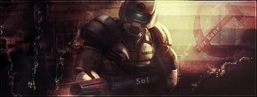
Is that a USSR logo?
<<banned from SRF for bot atmission. -SG>>
Sol
Regular Member
Posts: 321 Joined: Tue Jan 30, 2007 9:21 amQuick Reply: YesLocation: Sparta
Contact:
Post
by Sol Sun May 20, 2007 9:07 am
that ussr logo is from a Kirov airship which i used in the background ^_^
Artem
Regular Member
Posts: 317 Joined: Sun Oct 08, 2006 1:32 pm
Post
by Artem Sun May 20, 2007 9:09 am
The height seems to be fine, but it should be the other way around ^^
edit:: Here
<<banned from SRF for bot atmission. -SG>>
ElCapuccino
Frequent Member
Posts: 1122 Joined: Tue Sep 12, 2006 4:04 pm
Post
by ElCapuccino Sun May 20, 2007 12:53 pm
Dang thats nice! :O
<<banned from SRF got bot admission and illegal activities. -SG>>
Sol
Regular Member
Posts: 321 Joined: Tue Jan 30, 2007 9:21 amQuick Reply: YesLocation: Sparta
Contact:
Post
by Sol Mon May 21, 2007 12:28 am
Artem wrote: The height seems to be fine, but it should be the other way around ^^
i know but it didn't fit the sig with the airship the otherway round to i used transform
ElCapuccino wrote: Dang thats nice! :O
thanks capu, yeh i decided that modest would be good. plus u can't go wrong with
80% opacity and a overlay layer then CTRL+J then change the filter to soft light.
HeavyDutyLagger
Regular Member
Posts: 219 Joined: Sun Apr 22, 2007 6:36 am
Post
by HeavyDutyLagger Mon May 21, 2007 12:35 am
I thought I would see kane... lol
<<banned from SRF for remaking a banned account. -SG>>
rek
Ex-Staff
Posts: 5607 Joined: Sun Dec 31, 2006 10:46 amQuick Reply: YesLocation: darkroot garden
Contact:
Post
by rek Mon May 21, 2007 7:46 am
very nice lighting and colours but i dont see the flow 8/10
<3
0len
cin
Post
by cin Mon May 21, 2007 8:02 am
reK wrote: very nice lighting and colours but i dont see the flow 8/10
ummmm imo not all sigs need this "flow" you comment on in every sig rating
rek
Ex-Staff
Posts: 5607 Joined: Sun Dec 31, 2006 10:46 amQuick Reply: YesLocation: darkroot garden
Contact:
Post
by rek Mon May 21, 2007 8:54 am
lol....flow is direction.....
<3
0len
cin
Post
by cin Mon May 21, 2007 9:00 am
reK wrote: lol....flow is direction.....
i know lol. but your last halo sig didnt have any direction either
direction could mess it up.
ElCapuccino
Frequent Member
Posts: 1122 Joined: Tue Sep 12, 2006 4:04 pm
Post
by ElCapuccino Mon May 21, 2007 12:52 pm
Sol wrote: Artem wrote: The height seems to be fine, but it should be the other way around ^^
i know but it didn't fit the sig with the airship the otherway round to i used transform
ElCapuccino wrote: Dang thats nice! :O
thanks capu, yeh i decided that modest would be good. plus u can't go wrong with
80% opacity and a overlay layer then CTRL+J then change the filter to soft light.
wow...
You're an inspiration to us all...
<<banned from SRF got bot admission and illegal activities. -SG>>
shadowman20875
Post
by shadowman20875 Mon May 21, 2007 1:42 pm
like the lighting, thought the words where kinda out of place relative to ur color scheme though
Dystopia
Advanced Member
Posts: 2317 Joined: Thu Jan 04, 2007 8:37 pmQuick Reply: YesLocation: Off Topic
Post
by Dystopia Wed May 23, 2007 2:10 am
i really liking it 10/10
gj