Page 1 of 1
NSR - ghost rider
Posted: Sun May 13, 2007 10:32 am
by the.dead.illusion
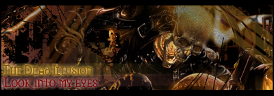
rate -/10 and ive finally added new text

Posted: Sun May 13, 2007 10:42 am
by ElCapuccino
yaaay finaly new text! ^^
anyway, looks good but it's a bit dark...
and you could made the ghost rider to the forground and make the background a little bit blur so there's a depth in it.
anyway, this is probly one of ur best.
7.7/10
Posted: Sun May 13, 2007 10:44 am
by rek
fix the lighting and outerglow = bad

Posted: Sun May 13, 2007 4:25 pm
by CrimsonNuker
black all around the sig (on top too)+lowered opacity= bad
6/10
Posted: Sun May 13, 2007 4:57 pm
by 0l3n
CrimsonNuker wrote:black all around the sig (on top too)+lowered opacity= bad
+1 on that and text looks bad.
Id give it a 4.5/10
Please dont hit me.
Posted: Sun May 13, 2007 8:01 pm
by Avalanche
IMO fix the text, and make it lighter. Its a bit too dark. The border as well, just go with the 1 px border.
Posted: Mon May 14, 2007 10:53 am
by the.dead.illusion
aarrgghhh!
im going crazy now
