Page 1 of 1
rate my sigs
Posted: Sun May 13, 2007 2:44 am
by the.dead.illusion
Posted: Sun May 13, 2007 2:52 am
by bladecarlo
6/10
9/10 so Cool!!
5/10
Posted: Sun May 13, 2007 3:10 am
by rek
bladecarlo wrote:6/10
9/10 so Cool!!
5/10
+1 and the text needs to change
Posted: Sun May 13, 2007 8:14 am
by ElCapuccino
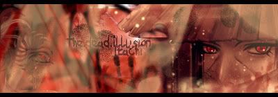
What annoyes me is that the text is always the same, and i don't like that font.
So try differend things with text.
The first one is kinda flat, there is no depth.
I think the second one is the nicest.
And at the 3th one: i don't like pixely borders ^^
6/10
7.7/10
6.8/10
Posted: Sun May 13, 2007 10:08 am
by the.dead.illusion
i make the text suit with my name but now im making a new sig with different text, and it is even my msn font lol. I didnt really do much things on the 3rd one, i just wanted to put it up here to show.
Posted: Sun May 13, 2007 4:31 pm
by CrimsonNuker
ur spidey one is the best, the text could use some work on all of them