Page 1 of 1
Brand New Sigs.
Posted: Mon Apr 09, 2007 2:38 am
by Mage Pker
I havent made a sig in a couple of months so last week i decided to start again.
ive been at it for about a year or 2. heres my newest products:
renji:

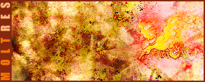
yes it is a pokemon sig:
Afro:

this was a gift to my friend Conman:

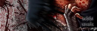
sasuke:
rukia:

YES i like anime leave me alone.
Posted: Mon Apr 09, 2007 3:23 am
by CrimsonNuker
the renji n rukia ones look pretty cool
Another Bleach Fanatic huh?
Welcome To The Club

Posted: Mon Apr 09, 2007 3:27 am
by apollo
bleach ftw!!! i like that renji one
Posted: Mon Apr 09, 2007 3:29 am
by rek
for the first one i dont really like the square in the top right corner but i like the tech stuff
i dont really like the bg for the 2nd one cuz its kinda plain imo and i couldnt see the render until i look closely at it

for teh 3rd one i cant find anything wrong with it but a border is always a good finishing touch
the 4th one looks too plain and i dont really like but grey stuff over the
middle guy
the render looks weird in the 5th one...wheres his ear

and the last one the bg looks 10/10 but the render isnt the best
Posted: Mon Apr 09, 2007 3:51 am
by CrimsonNuker
reK wrote:for the first one i dont really like the square in the top right corner but i like the tech stuff
i dont really like the bg for the 2nd one cuz its kinda plain imo and i couldnt see the render until i look closely at it for teh 3rd one i cant find anything wrong with it but a border is always a good finishing touch
the 4th one looks too plain and i dont really like but grey stuff over the
middle guy
the render looks weird in the 5th one...wheres his ear and the last one the bg looks 10/10 but the render isnt the best
1. Took me a while to see the render
2. I ate it =3
3. He Did: Dup Render>Luminous>Overlay
Posted: Mon Apr 09, 2007 6:02 am
by Mage Pker
reK wrote:for the first one i dont really like the square in the top right corner but i like the tech stuff
i dont really like the bg for the 2nd one cuz its kinda plain imo and i couldnt see the render until i look closely at it
for teh 3rd one i cant find anything wrong with it but a border is always a good finishing touch
the 4th one looks too plain and i dont really like but grey stuff over the
middle guy
the render looks weird in the 5th one...wheres his ear
and the last one the bg looks 10/10 but the render isnt the best
u dont have to see the entire render for all sigs.
Posted: Mon Apr 09, 2007 9:03 am
by Geedunk
Too blurry....
Posted: Mon Apr 09, 2007 9:10 am
by Mage Pker
Geedunk wrote:Too blurry....
which one

Posted: Mon Apr 09, 2007 9:16 am
by ElCapuccino
Mage Pker wrote:Geedunk wrote:Too blurry....
which one
3, 4, and maybe 5.
Posted: Mon Apr 09, 2007 9:20 am
by Geedunk
3 has got too much focal blur
Posted: Mon Apr 09, 2007 9:23 am
by Mage Pker
3 is blurred becuase i didnt want the focal point being around there. there is no blur around his face
and yes 4 is very blurred i couldnt\didnt feel like figuring out how to unblur. i had like 312391231 layers couldnt find the one to delete around his face.
how come no1 said 2
Posted: Mon Apr 09, 2007 9:40 am
by ElCapuccino
Mage Pker wrote:3 is blurred becuase i didnt want the focal point being around there. there is no blur around his face
and yes 4 is very blurred i couldnt\didnt feel like figuring out how to unblur. i had like 312391231 layers couldnt find the one to delete around his face.
how come no1 said 2
if something is too blurry, make new layer image > apply image then go to filter > sharpen.
And lower the opacity.
Posted: Mon Apr 09, 2007 9:47 am
by Geedunk
Mage Pker wrote:3 is blurred becuase i didnt want the focal point being around there. there is no blur around his face
and yes 4 is very blurred i couldnt\didnt feel like figuring out how to unblur. i had like 312391231 layers couldnt find the one to delete around his face.
how come no1 said 2
Yes, 3 is blurry around his face - there's no good focal.
Posted: Mon Apr 09, 2007 8:38 pm
by Rockshmo
I like the Afro one, has nice focus in it.. plus he's awesome.
Posted: Mon Apr 09, 2007 8:40 pm
by Zak
ownage/10
Posted: Mon Apr 09, 2007 10:44 pm
by apollo
quick question.. hjow do you do those lines and such that you have in the renji sig?