Page 1 of 1
Rate Em Up Baby!
Posted: Thu Mar 15, 2007 2:29 am
by Sol
Posted: Thu Mar 15, 2007 2:33 am
by 5m0k3
HENTAI!!!!!! OMFG I SEE A CHEST!!!! HENTAI HENTAI!!! thats what people been doing to me all day xD
anywho.. naruto 10/10 kakasi ... 5/10 i suppose res i could care less

Posted: Thu Mar 15, 2007 3:29 am
by taintofsleep
naruto 9/10 and kakashi is a 8/10... the render with the boobs... doesn't look like it should have boobs. or that face
Posted: Thu Mar 15, 2007 5:17 am
by rek
all look good 10/10

Posted: Thu Mar 15, 2007 11:34 am
by naljamees51
i like the 3rd one and the 4th

not gnna rate...
but they all look really nice

Posted: Thu Mar 15, 2007 1:34 pm
by Sol
taintofsleep wrote:naruto 9/10 and kakashi is a 8/10... the render with the boobs... doesn't look like it should have boobs. or that face
its actually a pirate woman
i'll try find you the original render i got it off Jakooldesigns.com
btw ty for the ratings more are appreciated
Posted: Thu Mar 15, 2007 3:28 pm
by ElCapuccino
i really don't like the 3th one...i've done that tutorial too, and i think u stopped doing that sig at step 5 or something...(thats a long tutorial, like 30 steps, maybe more)
Bad brushed...can use some effects...
but the other sigs are really good and some have styles that are original, very good!
1. 7.6/10
2. 7.5/10
3. 5/5/10
4. 7.0/10
5. 7.8/10
Posted: Thu Mar 15, 2007 3:38 pm
by XxYODAxX
I don't really like 1st 2 but they r good 3rd one like 8/10
Posted: Thu Mar 15, 2007 4:35 pm
by Sol
ElCapuccino wrote:i really don't like the 3th one...i've done that tutorial too, and i think u stopped doing that sig at step 5 or something...(thats a long tutorial, like 30 steps, maybe more)
Bad brushed...can use some effects...
but the other sigs are really good and some have styles that are original, very good!
1. 7.6/10
2. 7.5/10
3. 5/5/10
4. 7.0/10
5. 7.8/10
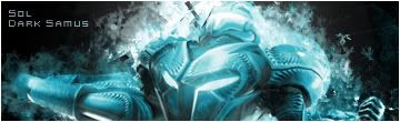
if your thinking about the dark samus tut by coke then ur right it does look like it however. its not. i used one on Jakool designs which uses various different filters and brushing techniques. i decided against c4d on number 3 mainly because i couldn't find any that flowed with the sig.


 <--- giving this one away if anyone wants it.
