Page 1 of 1
My newest creation, rate please.
Posted: Wed Feb 28, 2007 3:04 pm
by ElCapuccino
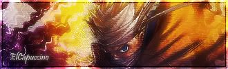
I like this one very much...
maybe its a little overdone, and i messed up with the tekst i guess...
some rate would be nice.
thx.

Posted: Wed Feb 28, 2007 3:34 pm
by Geedunk
1) The border isn't very good, imo.
2) It's too overcontrasted, imo.
3) The text isn't very well, imo.
- Try with less contrast.
Posted: Wed Feb 28, 2007 3:35 pm
by ElCapuccino
Geedunk wrote:1) The border isn't very good, imo.
2) It's too overcontrasted, imo.
3) The text isn't very well, imo.
- Try with less contrast.
what do u mean with imo, perfectionist?

Posted: Wed Feb 28, 2007 3:37 pm
by Geedunk
ElCapuccino wrote:Geedunk wrote:1) The border isn't very good, imo.
2) It's too overcontrasted, imo.
3) The text isn't very well, imo.
- Try with less contrast.
what do u mean with imo, perfectionist?
Since I always get flamed by retards, who doesn't share my opinion, I put "In my opinion" in the end..
Posted: Wed Feb 28, 2007 3:44 pm
by Sol
i always say imo because it proves that to me it is this and that people can disagree but its my opinion and i'm entitled to it.
personally i like geedunk he gives it to you straight even if his answer can be abit blunt
Posted: Wed Feb 28, 2007 3:46 pm
by ElCapuccino
ok thx for the explenation.

Posted: Wed Feb 28, 2007 4:40 pm
by 0l3n
Really overcontrasted.
Posted: Wed Feb 28, 2007 5:47 pm
by ElCapuccino
0l3n wrote:Really overcontrasted.
what do u mean by that?
u mean the sharpen effect?
Posted: Wed Feb 28, 2007 6:09 pm
by Geedunk
ElCapuccino wrote:0l3n wrote:Really overcontrasted.
what do u mean by that?
u mean the sharpen effect?
It's hard to explain. It's when the colors go from seperate to mixing and being too bright. Try to make a gradient - red to blue fx and do the adjustment layer "Brightness/contrast". - Throw the contrast high, slowly and you'll see.
Posted: Wed Feb 28, 2007 9:47 pm
by taintofsleep
Lol, but geedunk has seen some good sigs. haha
Posted: Wed Feb 28, 2007 11:05 pm
by CrimsonNuker
Dont like the texture.
Posted: Thu Mar 01, 2007 2:08 am
by Caras
You put to much texture into it.
Posted: Thu Mar 01, 2007 4:54 pm
by Alphanum3ric
Too much 'radiation' effects... but a decente job.. 7/10