Page 1 of 1
My Sigges
Posted: Fri Feb 23, 2007 2:11 am
by 5m0k3
Posted: Fri Feb 23, 2007 2:14 am
by Shimohime
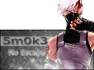
Text is kind of bad...
Kakashi pop-out sig, I like it; but would be better if you don't cut off the top of his head.
The Sasuke one has a really blurry render. Try using clear renders =)
Posted: Fri Feb 23, 2007 10:25 am
by Snudge
Color your backgrounds more

Posted: Fri Feb 23, 2007 11:30 am
by naljamees51
you shold do something with text

and +1 about the background
the 'smok3' sig what is 5th i think it is the best... just make the border and do a colorad background

Posted: Fri Feb 23, 2007 2:27 pm
by ElCapuccino
all your sigs are just dark colourless backgrounds, a render and some text.
TIP: do ol3n's tutorial!
u can find it in the artistic corner
Posted: Fri Feb 23, 2007 2:28 pm
by 0l3n
|
|
|
|
\/