Page 1 of 2
So.. I got a little Artistic
Posted: Thu Feb 22, 2007 4:00 pm
by Key-J
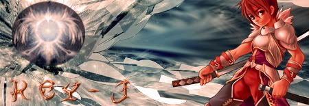
Yeah, i had done everything i needed to do today, so i sat down.. N said a what the hell lets give it a go...
Sat down, started with one, and then finished with six that i liked

So yeah, here you guys take a look, tell me what you think n which one you like
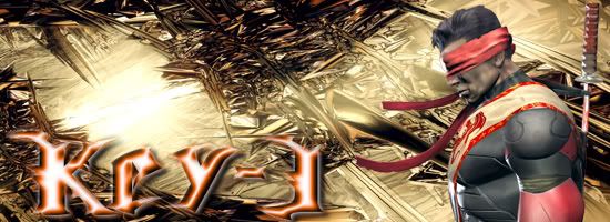
1st One.

2nd One.
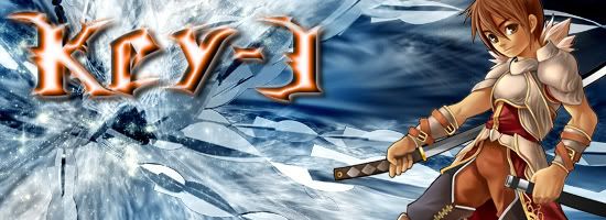
3rd One.
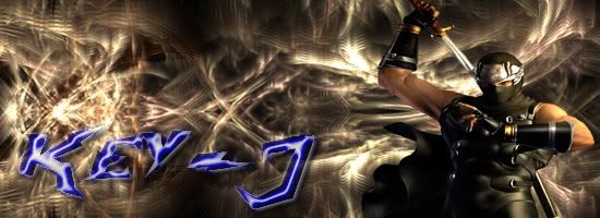
4th One.

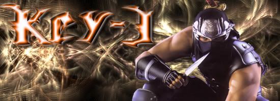
5th One.
6th One.
Yeah so rate them, tell me what you like and dont like
Posted: Thu Feb 22, 2007 4:17 pm
by RuYi
I love the 4th one!

The others are nice too, but 4 is my favorite!
Posted: Thu Feb 22, 2007 4:24 pm
by Key-J
Lolz
Well yeah, i like 1-4.. However i really like 3. I just wish i could make it a bit bigger tho, but still fit in the sig!!!
With 1, i might need to change the text a lil
With 2, i think im going to have to change the Render, make it a lil more exciting....
4... You just like it cuz it looks like me n im that cute


Posted: Thu Feb 22, 2007 4:38 pm
by KimaEri
3rd one FTW! :3 ((Why don't we have the :3 Nod?))
Posted: Thu Feb 22, 2007 4:44 pm
by ElCapuccino
really, try a new background and change the text...
Posted: Thu Feb 22, 2007 4:47 pm
by 0l3n
Go through a few tutorials. The background is to plain.
Looks like C4d+Render+Text.
The 3rd one looks the best.
Posted: Thu Feb 22, 2007 4:55 pm
by Key-J
I know... I need to improve.. but hey, im getting there
Posted: Thu Feb 22, 2007 6:10 pm
by Luoma
looks ok but change the font please!
Posted: Thu Feb 22, 2007 6:47 pm
by naljamees51
Key-J wrote:I know... I need to improve.. but hey, im getting there
keep going...
i dunno what to say because i hawent done anything with c4d ^^'
Posted: Thu Feb 22, 2007 9:36 pm
by Avalanche
Good start, learn to blend the renders. Change the text a little, play around with it. Also, try learning how to use brushes instead of sticking a c4d on there =P.
Posted: Thu Feb 22, 2007 10:19 pm
by nightbloom
They are unnaturally BIG. lol it makes them look gawdy. Ive noticed that when ppl start making sigs, they always make them HUGE, then they get smaller as your skills improve. All your text looks identical in each one, Play with that, make hundreds of different kinds and push all the buttons to see what they do. I tend to use very plain text because I think over processed text clashes with the sig itself. They know your name, its written on your post. I only put a name there to keep it from getting used by someone else. lol
Posted: Thu Feb 22, 2007 10:34 pm
by Draquish
Too big.
Same BG.
Not much work done in the sig itself.
Same text...different colors...
Border.
No real "Theme" to them =/

Posted: Fri Feb 23, 2007 1:09 am
by francomade
If fonts are changed to smaller, it would look better.
Posted: Fri Feb 23, 2007 1:38 am
by nightbloom
The trick is making your sig look like a complete picture, like it was made that way. Your render, name and BG have nothing to do with eachother. If you blend them together more maybe. Soften the edges of your render.. or highlight it. Id help you more there, but I dont use photoshop and the paintshop controls are very different. Im sure the rest of these guys can point you to a few tuts that better explain how PS works....
Posted: Fri Feb 23, 2007 3:10 am
by francomade
nightbloom wrote:The trick is making your sig look like a complete picture, like it was made that way. Your render, name and BG have nothing to do with eachother. If you blend them together more maybe. Soften the edges of your render.. or highlight it. Id help you more there, but I dont use photoshop and the paintshop controls are very different. Im sure the rest of these guys can point you to a few tuts that better explain how PS works....
What program did you used? Your sigs looks awesome!
Posted: Fri Feb 23, 2007 3:35 am
by 5m0k3
Your renders dont blend good X_X they just sit there no blending kind of blah thats my 2 cents ^^
Posted: Fri Feb 23, 2007 3:39 am
by nightbloom
I use PaintShop Pro... It's harder to use than PhotoShop according to most ppl, but Ive used it a long time and Im used to it.
Posted: Fri Feb 23, 2007 3:45 am
by Cyndaine
gj! i i rlly like the 3rd one. ice effect thing in the bg is nice
Posted: Fri Feb 23, 2007 8:35 am
by Key-J
Thnx, im working on it now to make it better.. and the reason its so big, is cuz its to show tis all
Posted: Fri Feb 23, 2007 10:07 am
by timtam
Number 1 and 3 look good!
Posted: Fri Feb 23, 2007 2:14 pm
by Key-J
Well for now, im going to stick with this one...
Do expect modifications XD
Posted: Fri Feb 23, 2007 2:58 pm
by Sol
here the 4th one i resized it and did alittle editting.

Posted: Fri Feb 23, 2007 2:59 pm
by Sol
i'll let u put a boarder on it ...
Posted: Fri Feb 23, 2007 5:09 pm
by Key-J
Meh i decided to go with something else, but ill keep the above ones in reserve
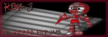
, I really like it. Simple, but cool
Posted: Fri Feb 23, 2007 7:46 pm
by 0l3n
Its really nice.
I loled
Posted: Fri Feb 23, 2007 7:48 pm
by RuYi
It's cute!
Posted: Sat Feb 24, 2007 4:12 am
by Key-J
Thnx guys
I think i need to add something else to it, like a lil speech bubble or something XD
O n RuYi, really nice sig 2 you as well. Love the theme.
Posted: Sat Feb 24, 2007 9:27 am
by Key-J
Forgive the double post, but how does everone like me new Avy

Posted: Sat Feb 24, 2007 1:16 pm
by 0l3n
Nice avy. I think you should try making a sig like that.
Posted: Sat Feb 24, 2007 6:22 pm
by Key-J
Make a sig like this ey?... Hmmm good idea..
Buy how?