Page 1 of 1
my second try on new techniques with photoshop, rate?
Posted: Thu Feb 22, 2007 1:28 pm
by ElCapuccino
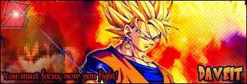
thats it.
I made that one for a friend of mine...
so what do u think?
any comments, something?
is it better then the one i'm using?
thx.
ElCapuccino
Posted: Thu Feb 22, 2007 2:22 pm
by 0l3n
Nice one there, colours mix and text fitts. Allthough the Z buggs me.
Posted: Thu Feb 22, 2007 2:51 pm
by hitokiri
dont like the glow on him really. And the text bothers me. I know its a cartoon but the name with the font/colors comes off like too kiddy. i dunno lol its a weird style but not bad.
Posted: Thu Feb 22, 2007 4:42 pm
by ElCapuccino
HTVHitokiri wrote:dont like the glow on him really. And the text bothers me. I know its a cartoon but the name with the font/colors comes off like too kiddy. i dunno lol its a weird style but not bad.
i searched for a dragonball font, and thats it...but thx.
Posted: Thu Feb 22, 2007 6:31 pm
by naljamees51
0l3n wrote: Allthough the Z buggs me.
+1
i think it is better then what are u using right now..because i still don't get it what is it (render i mean)
Posted: Thu Feb 22, 2007 7:57 pm
by ElCapuccino
naljamees51 wrote:0l3n wrote: Allthough the Z buggs me.
+1
i think it is better then what are u using right now..because i still don't get it what is it (render i mean)
i know, totally agree with you

Posted: Fri Feb 23, 2007 8:58 pm
by QingMei
Nice one, something about the text bothers me though. I actually like the sig you're using now better.. :]
Posted: Fri Mar 02, 2007 1:46 pm
by rek
naljamees51 wrote:
i think it is better then what are u using right now..because i still don't get it what is it (render i mean)
u dont know what it is...?
ill give u a 7/10
Posted: Fri Mar 02, 2007 3:13 pm
by Alphanum3ric
Overuse of lame ps effects... allthough I have to admit that uve done a good job turning lame stuff alltoghether in a decent composition.
And no... the older sig is way better...
The trick with ps is when u make an artwork u try to make something that is not related to the program... something that u look and u see the hand of the designer and not the program that he used... ...and that is the lame effects i said.
KeEp uP!
