Digital art design, renderings, signatures and anything art related. Upload pictures of your newest work or ask for feedback. Post graphics requests or discuss art in general.
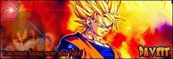
dont like the glow on him really. And the text bothers me. I know its a cartoon but the name with the font/colors comes off like too kiddy. i dunno lol its a weird style but not bad.
HTVHitokiri wrote:dont like the glow on him really. And the text bothers me. I know its a cartoon but the name with the font/colors comes off like too kiddy. i dunno lol its a weird style but not bad.
i searched for a dragonball font, and thats it...but thx.
<<banned from SRF got bot admission and illegal activities. -SG>>
Overuse of lame ps effects... allthough I have to admit that uve done a good job turning lame stuff alltoghether in a decent composition.
And no... the older sig is way better...
The trick with ps is when u make an artwork u try to make something that is not related to the program... something that u look and u see the hand of the designer and not the program that he used... ...and that is the lame effects i said.

 [Scoundrels]