Page 1 of 1
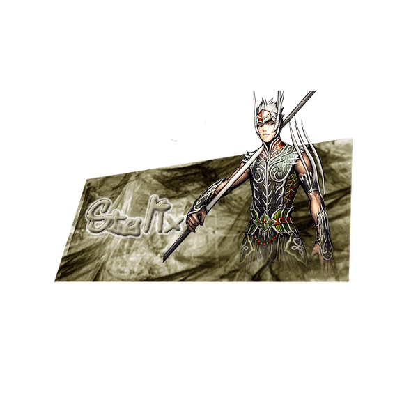
my popout..
Posted: Wed Feb 21, 2007 9:50 am
by djanvier
this is my first pop-out sig ive made.. but i dont know how to resize it so.. rate it

_____
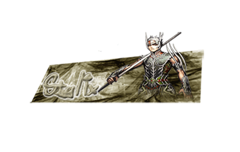
this is my outcome of resizing it..
Posted: Wed Feb 21, 2007 9:53 am
by djanvier
i can resize but.. it will be tiny.. and blury..
Posted: Wed Feb 21, 2007 10:12 am
by Dorlingz
It's alright....
Ummm...
Trying to think of advice...
Make sure you can find a full render if you want to do a popout, cause yeah it's sort of cut off at the top.
Posted: Wed Feb 21, 2007 12:59 pm
by shadowskill
i like it
but its can be better if that stick have something on it (like glavie and spears have)
Posted: Wed Feb 21, 2007 1:12 pm
by Rockshmo
It'd be better to use a stock that isn't cut off, especially in the part that pops out.
Since it's a popout and you're going to distort the canvas try making it a bit smaller so the final overall image isn't so big.
Posted: Wed Feb 21, 2007 3:47 pm
by 0l3n
Oh snap, he used my render... first one ever
Posted: Wed Feb 21, 2007 9:28 pm
by djanvier
0l3n wrote:Oh snap, he used my render... first one ever
yep
its yours
.. i tried used my lasso to let the legs go into the pic.. this is my first ever popout so ill get better
Posted: Wed Feb 21, 2007 10:34 pm
by Draquish
Sorry to be mean but....eww.
Tutorials work wonders

Posted: Thu Feb 22, 2007 1:21 am
by ranger4life
i agree with the other comments,
you should get FULL render cuz without that it looks kinda....bad
Posted: Thu Feb 22, 2007 1:40 am
by PimpC
draquish wrote:Sorry to be mean but....eww.
Tutorials work wonders
OMG sweet sig draquish..my fav ive seen you make.
ONTOPIC-that thing doesnt work at all sized down sorry man.
Posted: Thu Feb 22, 2007 1:52 am
by djanvier
ya **** heads dont be mean... like its just an SIG! and read its my first POPOUT!
Posted: Thu Feb 22, 2007 1:53 am
by djanvier
i dont spend time all day on my computer like you people.. so i aint no ..... nerd like yall
Posted: Thu Feb 22, 2007 2:14 am
by Shimohime
Hey, I don't spend all my time in front of a computer either

.
Anyways, some things just take time. You'll get better at it.
A few minor critiques:
-text? choppy at the edges
-why is it so blurry after the resize? did you use transform to resize?
-the legs would look better w/o the greenish color over the bottom
Posted: Thu Feb 22, 2007 3:09 am
by Draquish
If you can't take the heat than whyTF did you plan a vacation in Cancun?
Dude just take it...no talky
I believe I have seen a sig like yours...probrably was in NSL or something; but IMO you didn't get the whole style right...maybe setting your BG a little lower...so it kind of looks like he is poppoing out of the paper. Just a suggestion
Posted: Thu Feb 22, 2007 4:11 am
by PimpC
that shit just sucks bottom line.
Posted: Thu Feb 22, 2007 5:09 am
by chickenfeather

how big did you want this?