Page 1 of 1
Few I've made.
Posted: Wed Feb 14, 2007 4:36 am
by Posei
Posted: Wed Feb 14, 2007 4:39 am
by Draquish
I believe you have your own little style going on...I say you build up on it. All by yourself.
Posted: Wed Feb 14, 2007 6:18 am
by CrimsonKnight
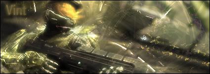
I like the 2nd one.
Posted: Wed Feb 14, 2007 7:23 am
by mcclane1
Posted: Wed Feb 14, 2007 8:36 am
by Deacon
woah, nice man

Posted: Wed Feb 14, 2007 11:17 am
by Nave47
The 2nd one kinda looks like 0l3ns sig. but a bit bigger and brighter
Posted: Wed Feb 14, 2007 2:41 pm
by 0l3n
Nave47 wrote:The 2nd one kinda looks like 0l3ns sig. but a bit bigger and brighter
Lol at that

And i think the sigs are fine but to big.
Posted: Wed Feb 14, 2007 2:41 pm
by naljamees51
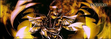
i like all of them
and mostly the first
only if it wold be a litl smaller

Posted: Wed Feb 14, 2007 2:57 pm
by RuYi
First one's my favorite aswell, awesome render, good use of colors!
Posted: Wed Feb 14, 2007 6:11 pm
by Luoma
Very nice sigs, keep up the good work!
Re: Few I've made.
Posted: Wed Feb 14, 2007 6:35 pm
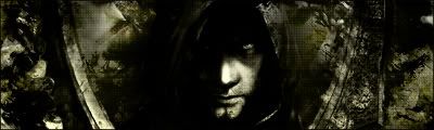
by satman83
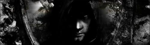
wow am loving this Prince of Perisa Sig
Posted: Wed Feb 14, 2007 6:37 pm
by 0l3n
I think he should add a tiny bit colour to that one, like a gradient map on low opacity or something.
Posted: Wed Feb 14, 2007 7:03 pm
by hitokiri
yeah or some kind of lighting. The render is dark to begin with so you want to try and kinda balance the signature.
Re: Few I've made.
Posted: Wed Feb 14, 2007 7:06 pm
by satman83
satman83 wrote:wow am loving this Prince of Perisa Sig
well dont make it too light, it is meant to be dark guys

Posted: Wed Feb 14, 2007 7:13 pm
by 0l3n
Yeah I know.
Posted: Wed Feb 14, 2007 7:32 pm
by hitokiri
Well yeah i just meant as in Ol3n's signature for example. Its a basically dark signature, however lighting is place in to draw focus and it balances the signature making it so its not too dark. but yeah dont make it too light or it ruins it.
Posted: Wed Feb 14, 2007 7:51 pm
by 0l3n
I think he made the render to dark because you can't see any details.
Posted: Wed Feb 14, 2007 11:52 pm
by Miyoko
The 2nd one has way to sharp and ugly stuff on it (c4d's I guess).
Posted: Tue Feb 20, 2007 7:11 am
by Posei
Thx for the comments all
Played around with the Prince of Persia one, made it smaller and added some color and lighting. Is this better?
Posted: Tue Feb 20, 2007 4:05 pm
by taintofsleep
Looks a lot better. I like the 1st and 4th best tho