Page 1 of 1
Rate my signs
Posted: Fri Feb 09, 2007 7:46 pm
by Demispike

Plz tell me which one is better and rate or from 1-10/10
Posted: Fri Feb 09, 2007 8:24 pm
by 0l3n
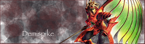
first one: The render doesnt fitt the background and its not blended 2/10
second one: The background is better in this one and it fitts the render, i dont really like pop-out sigs to much but this isnt the problem here, the problem is that the render is so small that you can hardly see anything its kinda blurry.
Posted: Fri Feb 09, 2007 8:33 pm
by Demispike
Ty for the tips i dint make it ^^
Posted: Fri Feb 09, 2007 8:39 pm
by 0l3n
Demispike wrote:Ty for the tips i dint make it ^^
Ya i know, just checked out the other thread you made

Posted: Fri Feb 09, 2007 8:43 pm
by Demispike
xD Can u make one avatar for me and a sign then i can see which is better i like KH for my sign and avatar if u wanna do tyvm
Posted: Fri Feb 09, 2007 9:55 pm
by 0l3n
KH?
Posted: Fri Feb 09, 2007 9:57 pm
by Demispike
Kingdom hearts
Posted: Fri Feb 09, 2007 9:57 pm
by 0l3n
Got it

Posted: Sat Feb 10, 2007 11:59 am
by naljamees51
Demispike wrote:xD Can u make one avatar for me and a sign then i can see which is better i like KH for my sign and avatar if u wanna do tyvm
i made u a sig....
and if 0l3n make's u a ava then i don't need to make u an ava

Posted: Sat Feb 10, 2007 1:03 pm
by Miyoko
Pop-outs are so ... yesterday >.>
Plus, we got a thread to get signatures rated.. why create new ones?
Posted: Sat Feb 10, 2007 2:24 pm
by Draquish
First one is not even blended.
And the second one is too dull for my taste.
Posted: Sat Feb 10, 2007 2:26 pm
by Demispike
Najalmees u can make a avatar for me make it from kingdom hearts