Digital art design, renderings, signatures and anything art related. Upload pictures of your newest work or ask for feedback. Post graphics requests or discuss art in general.
Key-J
Retired Admin
Posts: 8237 Joined: Fri Jun 23, 2006 2:21 pmLocation: BF3 waiting for BF4
Contact:
Post
by Key-J Tue Nov 14, 2006 1:37 am
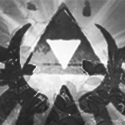
So i tried my hand at making a sig for my friend...
Rate and suggest.. BTW this is my second SIG ive made
2 Versions
1:
2:
Be nice..
GaiaX
Common Member
Posts: 150 Joined: Sat Nov 11, 2006 3:29 amQuick Reply: YesLocation: Oasis
Post
by GaiaX Tue Nov 14, 2006 1:58 am
I like it 8/10, though making the size smaller and adding a border would make it better
Key-J
Retired Admin
Posts: 8237 Joined: Fri Jun 23, 2006 2:21 pmLocation: BF3 waiting for BF4
Contact:
Post
by Key-J Tue Nov 14, 2006 2:05 am
Aightz.. Well the size doesnt matter cuz its not for this forums.. O and whcih one do u like better?
GaiaX
Common Member
Posts: 150 Joined: Sat Nov 11, 2006 3:29 amQuick Reply: YesLocation: Oasis
Post
by GaiaX Tue Nov 14, 2006 2:08 am
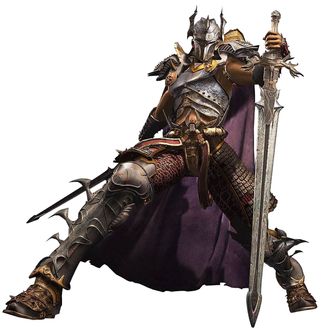
Not sure which one to pick since they both are 99% alike. Still, I guess I'll pick the first one because of two reasons. First, it shows the whole render, secondly it's first
Raincloud
Hi, I'm New Here
Posts: 17 Joined: Mon Nov 13, 2006 7:33 amQuick Reply: YesLocation: Alps
Post
by Raincloud Tue Nov 14, 2006 2:18 am
I like the 2nd one, the closeup of the char is nice
Pain is the flame that moulds the sword
sig courtesy of draquish
LittleTom
Active Member
Posts: 638 Joined: Thu Nov 02, 2006 7:39 pmQuick Reply: YesLocation: Life
Post
by LittleTom Tue Nov 14, 2006 2:20 am
Ya the second one is better.
Key-J
Retired Admin
Posts: 8237 Joined: Fri Jun 23, 2006 2:21 pmLocation: BF3 waiting for BF4
Contact:
Post
by Key-J Tue Nov 14, 2006 3:31 am
Good cuz my friend chose the 2nd one as well... I wanted to make a border.. but then saved it and forgot.. so i was like.. well wtvr
Luoma
Veteran Member
Posts: 3895 Joined: Thu Sep 14, 2006 8:23 amQuick Reply: YesLocation: Artists Corner & Aege
Post
by Luoma Tue Nov 14, 2006 7:15 am
LittleTom wrote: Ya the second one is better.
+1
<<banned from SRF for proof of botting. -SG>>
satman83
Site Contributor
Posts: 9541 Joined: Tue Oct 31, 2006 9:54 pmQuick Reply: YesLocation: London
Contact:
Post
by satman83 Tue Nov 14, 2006 11:48 am
Key...i have to say the second one to.....also...who is Faros
have you been cheating on SRO.....
nansif2
Casual Member
Posts: 93 Joined: Wed Sep 27, 2006 11:17 amQuick Reply: YesLocation: Poseidon
Post
by nansif2 Tue Nov 14, 2006 12:43 pm
the 2nd one is very nice!!
Key-J
Retired Admin
Posts: 8237 Joined: Fri Jun 23, 2006 2:21 pmLocation: BF3 waiting for BF4
Contact:
Post
by Key-J Tue Nov 14, 2006 3:43 pm
Glad you like it guys.. He gave me the render... If u want ill host it and yall are free to use it
nansif2
Casual Member
Posts: 93 Joined: Wed Sep 27, 2006 11:17 amQuick Reply: YesLocation: Poseidon
Post
by nansif2 Tue Nov 14, 2006 3:47 pm
Key-J wrote: Glad you like it guys.. He gave me the render... If u want ill host it and yall are free to use it
pls do it!!! really nice render!!
hitokiri
Veteran Member
Posts: 3501 Joined: Fri Feb 17, 2006 5:27 pmLocation: here
Post
by hitokiri Tue Nov 14, 2006 4:25 pm
i would say make smaller not because of the forums, but because the more unnecessary space, it doesnt look as good. yours is an exception because it has an awesome background though. but usually the smaller it is, the more unrepetitve it seems. very nice though man
[Stealth] / [Ninjitsu] / [Relentless] /
[Scoundrels] Troy / Pacific / Venus / Fembria / Salvation / Theta / Origin Online - Genesis
Reise
Forum Legend
Posts: 6650 Joined: Tue May 16, 2006 12:35 amLocation: Off Topic
Contact:
Post
by Reise Tue Nov 14, 2006 4:58 pm
Been there done that lol
Key-J
Retired Admin
Posts: 8237 Joined: Fri Jun 23, 2006 2:21 pmLocation: BF3 waiting for BF4
Contact:
Post
by Key-J Tue Nov 14, 2006 5:09 pm
Wahahahahahaah
0l3n
Elite Member
Posts: 5184 Joined: Fri Jun 16, 2006 1:45 pmQuick Reply: YesLocation: Artists Corner
Post
by 0l3n Tue Nov 14, 2006 6:42 pm
its a c4d in the backround right?
Caras
Frequent Member
Posts: 1337 Joined: Fri Sep 01, 2006 3:15 amQuick Reply: YesLocation: Place to place.
Post
by Caras Wed Nov 15, 2006 8:05 am
Looks like all you did was put a few c4ds in there, added a glass-textured text and slaped a render on. 5/10
oktaytheazer
Frequent Member
Posts: 1123 Joined: Mon Nov 06, 2006 12:16 pmQuick Reply: Yes
Post
by oktaytheazer Fri Dec 01, 2006 10:21 pm
Key-J wrote: So i tried my hand at making a sig for my friend...
Rate and suggest.. BTW this is my second SIG ive made
2 Versions
1:...
2:...
Be nice..
"be nice"
lol
Shimohime
Active Member
Posts: 788 Joined: Tue Feb 28, 2006 11:40 pmQuick Reply: YesLocation: Xian
Post
by Shimohime Sat Dec 02, 2006 9:24 pm
It's a cool sig, but I would suggest changing the colors/add color effects to the background to correlate with the render.
Lvl 5x- Ice Archer
Read my avatar tutorial
here
naljamees51
Frequent Member
Posts: 1054 Joined: Tue Mar 21, 2006 1:34 pmQuick Reply: YesLocation: Estonia
Post
by naljamees51 Sun Dec 03, 2006 9:51 am
wow...i really like thet sig
but...i cant explane whats wrong with it...sooo...i hope u wont be furious il exblane it with bicture...u can see what i chansed
dont hit me
I'm gay, lets cry.


 [Scoundrels]


