Page 1 of 1
Rate Plz
Posted: Tue Oct 31, 2006 2:32 am
by Chosn1
Only burshes used were for the falling text and I made 'em

All the tech was done wit a 1px brush. Anyway here they are:
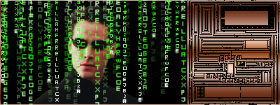
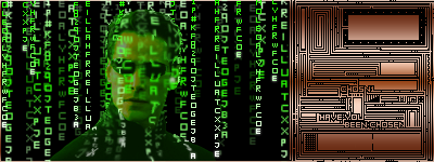
In the second one I attempted to make him look like he wasn more "in" the matrix itself.
Posted: Tue Oct 31, 2006 3:38 am
by Draquish
the 2 parts of the sig dont really........4 get my comments, what IMP are u using

Posted: Tue Oct 31, 2006 3:45 am
by TyeMaiShu
that chip thing over on the side is nicely done. IMO it may look better if the text was more opague over Neo's face.
Posted: Tue Oct 31, 2006 3:45 am
by Chosn1
Posted: Tue Oct 31, 2006 6:13 am
by Chosn1
TyeMaiShu wrote:that chip thing over on the side is nicely done. IMO it may look better if the text was more opague over Neo's face.
I dun know how or if its possible, but i would like to eliminate neo all togather and just have a the falling text break in way that you can see his out(glasses and all) if anyone has tips that would be awesome.
Posted: Tue Oct 31, 2006 8:06 am
by naljamees51
oo nice toublepost
ok the secpunt sig is better ^^
il giw:
1) 3/5
2) 4/5
always can be better

Posted: Tue Oct 31, 2006 3:20 pm
by Caras
Im not a big fan of the matrix. But if you did the chip with all brushes I gotta hand it to you, nice work.
Posted: Tue Oct 31, 2006 4:22 pm
by Chosn1
naljamees51 wrote:oo nice toublepost
ok the secpunt sig is better ^^
lol wa? I tan't eben untersand wat tat sayz
And there were no brushes on the chip part Caras.
Posted: Tue Oct 31, 2006 4:45 pm
by Rockshmo
oo nice toublepost = oo nice doublepost
ok the secpunt sig is better = ok the second sig is better
Posted: Tue Oct 31, 2006 5:01 pm
by naljamees51
Chosn1 wrote:naljamees51 wrote:oo nice toublepost
ok the secpunt sig is better ^^
lol wa? I tan't eben untersand wat tat sayz
And there were no brushes on the chip part Caras.
oi sry...my fingers are grazy
Posted: Tue Oct 31, 2006 5:31 pm
by 0l3n
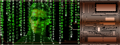
for some reson i like the first one better, and i think you should let the "Tech" stuff on the right go in litte to the left, not much some strings or so.
Posted: Wed Nov 01, 2006 5:13 pm
by Chosn1
0l3n wrote:for some reson i like the first one better, and i think you should let the "Tech" stuff on the right go in litte to the left, not much some strings or so.
something like this:
Posted: Wed Nov 01, 2006 5:16 pm
by 0l3n
ya that was better. atleest i think so
Posted: Wed Nov 01, 2006 5:53 pm
by Chosn1
ya i think so too, thnx fer the idea
Posted: Wed Nov 01, 2006 5:59 pm
by Shox
Chosn1 wrote:I dun know how or if its possible, but i would like to eliminate neo all togather and just have a the falling text break in way that you can see his out(glasses and all) if anyone has tips that would be awesome.
To do that you will need to create your own matrix text, which is very easy. Just go to
http://www.pixel2life.com and search matrix in photoshop.
Posted: Wed Nov 01, 2006 6:07 pm
by Chosn1
Shox wrote:Chosn1 wrote:I dun know how or if its possible, but i would like to eliminate neo all togather and just have a the falling text break in way that you can see his out(glasses and all) if anyone has tips that would be awesome.
To do that you will need to create your own matrix text, which is very easy. Just go to
http://www.pixel2life.com and search matrix in photoshop.
I'm not sure I understand. But that might be 'cuz I was not clear

See in the second sig, how the falling text runs along him? I would like to make it break in a way so that all you would see is the out line of him and then i could remove the actual pic of neo and just have a matrix version of him. Is this making any sense. I think wat I'm lookin' for is some techniques.
Posted: Wed Nov 01, 2006 7:02 pm
by 0l3n
i think that whould be made by changing the light of the "matrix text". like: his glases has one colour, hi skin another and cloathes another, and make it bright. dono if this will work but in theory its possible. and you will have to make the letters real tight
hopw you understand
Posted: Thu Nov 02, 2006 4:27 pm
by 0l3n
maby if you give me the render and the brushset i could try to make it myself, just to see if it works.