Page 1 of 1
new sig (yes, another one)
Posted: Sun Oct 29, 2006 9:41 am
by nightbloom
OK, story behind this one... I was joking with Fly. He loves to call himself God, kinda an inside joke. So I ask, if he is God then who am I, Mary? He thinks for a minute and says, "No, you are the Devil of course."
LOL
So because the sig I made for him is kinda angelic looking, I made one to match his.
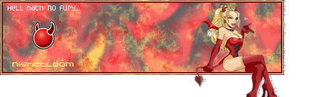

Whatcha think? (OMG AOE, look, no squares! Happy now? LOL)
Posted: Sun Oct 29, 2006 9:43 am
by Caras
Backround is poor and the pop out cuts off at the bottom.
Posted: Sun Oct 29, 2006 9:43 am
by Twisted
I dont like the font but apart from that you have some seriouse tallent, 10/10 2 thumbs up Well done!

Posted: Sun Oct 29, 2006 9:47 am
by nightbloom
Caras wrote:Backround is poor and the pop out cuts off at the bottom.
I dont like those overly busy backgrounds.... They look over processed to me. I realize her feet are cut off, but it would exceed the forum limits if I made the canvas bigger and distort her too much to make her much smaller. I tried to compromize... Maybe I will work it over again.
Posted: Sun Oct 29, 2006 9:50 am
by Quyxz
Nice sig.

But I still think you should make your stock at least a little bit bigger.

Now it look skinda empty for me.
And how did you make the background?
Posted: Sun Oct 29, 2006 10:19 am
by nightbloom
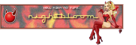
OK, reworked it a bit...
Matching ava

Posted: Sun Oct 29, 2006 10:31 am
by Twisted
avator is awsome, firgure is better but i dont like the writing

My opinion though, Well done!
Posted: Sun Oct 29, 2006 10:39 am
by nightbloom
Thanks twisted.. ^^
@ Quyxz
The first background is a standard pic using a black bg with a flame tube I made a long time ago over it. I added uniform noise, reduced the saturation by about 25 percent and softened the noise a bit with the softening tool. The first one I overlayed with a marble brush using yellow and red, the second I skipped that. The square was too small for all that noise.
Oh, and I use PaintShop Pro, not photoshop, but I am sure the basic elements are really similar.
Posted: Sun Oct 29, 2006 12:10 pm
by AoENuker
good job
no squares FTW
Posted: Sun Oct 29, 2006 1:25 pm
by Quyxz
nightbloom wrote:Thanks twisted.. ^^
@ Quyxz
The first background is a standard pic using a black bg with a flame tube I made a long time ago over it. I added uniform noise, reduced the saturation by about 25 percent and softened the noise a bit with the softening tool. The first one I overlayed with a marble brush using yellow and red, the second I skipped that. The square was too small for all that noise.
Oh, and I use PaintShop Pro, not photoshop, but I am sure the basic elements are really similar.
Yeah, the tools are a bit different, but I understand it. ok
GJ
Posted: Sun Oct 29, 2006 1:30 pm
by AoENuker
"Hell Hath no Fury" <----- i think thats a typo
Posted: Sun Oct 29, 2006 1:40 pm
by Snudge
No, thats 'ancient' english. Just like thee(if thats spelled right ><), and thou.
Thee shan't steal, unless thy hath a certificate.
Orso :p Bad sentence, nvm ^^
Posted: Sun Oct 29, 2006 3:14 pm
by AoENuker
lol o. ok
Posted: Sun Oct 29, 2006 3:43 pm
by Shox
good job! you and fly make me smile
Posted: Sun Oct 29, 2006 7:08 pm
by nightbloom
That is half of what I thought was a universal saying... lol
"Hell hath no fury like a woman scorned."
THanks guys, Ive never really talked to other artists before about making sigs. Ive always just done it. Learned by trial and error and just pushing buttons to see what they do. I know you all use another program, but Ive learned a few thing anyways.
Ive also never had my work critiqued before. So that has been interesting.
Posted: Sun Oct 29, 2006 7:09 pm
by Caras
The new one looks alot better.
Posted: Sun Oct 29, 2006 7:33 pm
by AoENuker
except its always the same text over and over and over and over lol