Page 1 of 1
Edit: Sig Rating :D
Posted: Sat Oct 28, 2006 7:00 pm
by Key-J
Well i has a couple of great Sigs made for me.. However they werent exactly to my liking (dont mean to sound picky

)! Any way so i decided to give it a try myself and after some time and layers and stuff i came up with my current sig

! Which im quite happy about for a first timer... So i wanted to ask if you could rate my sig and possible give me tips on how to improve it...
P.s his is my edited thread of my sig request instead of making a new one.
Key-J
Posted: Sat Oct 28, 2006 7:22 pm
by Draquish
Can u plx make a render out of that screenshot

if u dont know u could use moog's guide on it

If u do then ill make u a sig ASAP

<----is 2 lazy ATM to render that screenie

Posted: Sat Oct 28, 2006 7:45 pm
by Key-J
Will do... but remember you dont need to use the things i gave you, nor make its totally SRO related..
Posted: Sat Oct 28, 2006 8:18 pm
by Key-J
Here you go my INCREDIBLY BAD! Renders...
http://i69.photobucket.com/albums/i64/Keyjizzle/me.jpg
and
http://i69.photobucket.com/albums/i64/K ... e/Wolf.jpg
P.s Could someone make a tut for Photoshop Elements.... Cuz thats all im working with at da mo
N soz for the double post....
Posted: Sat Oct 28, 2006 8:26 pm
by Quyxz
I'm just going to make you a sig now, without SRO stocks.
Posted: Sat Oct 28, 2006 8:31 pm
by ElCapuccino
ok i'll try to make one.
Just started making sigs so...
Posted: Sat Oct 28, 2006 8:44 pm
by Key-J
Many thnx guys, Im going out with my grandfather for a bit but ill return soon so soz if you post it and i dont comment straight away.
P.s If possible can you use Text3 as it is my fav
however if its conflicts your SIG design or you have a better text. Feel free to use it, Diversity is the spice of life remember
Posted: Sat Oct 28, 2006 8:47 pm
by ElCapuccino
the render of ur char kinda sux...so the sig was little fcked up to...
Well this is it.
PS: i don't think u will use it cuz those other ppl make way better sigs.

Posted: Sat Oct 28, 2006 9:02 pm
by Quyxz
I just finished mine. I tought it was going to be very ugly, but after I sharpened it, it became way better.
I made you 2 versions, choose the one you like most.

V1:

V2:

Posted: Sat Oct 28, 2006 9:31 pm
by ElCapuccino
woow ok u beat me

Posted: Sat Oct 28, 2006 10:47 pm
by Key-J
WoW nice sigz Quyxz... Not much difference between them but nice... Just one tiny itsy bitsy little thing...
Im a Guy... Apart from that very nice.... Any chance on a re-make? doesnt have to be now.. take ur time
Posted: Sat Oct 28, 2006 10:50 pm
by AoENuker
doesn't matter if ur a guy or not. that sig is sexy.
i would use it if i didn't have this one.
Posted: Sat Oct 28, 2006 10:52 pm
by Quyxz
Key-J wrote:WoW nice sigz Quyxz... Not much difference between them but nice... Just one tiny itsy bitsy little thing...
Im a Guy... Apart from that very nice.... Any chance on a re-make? doesnt have to be now.. take ur time
The difference is the text.
But you say you like the sig, but I have to make a remake? I don't really understand.
Edit: Ah, you mean it is a girl sig? I don't think it's a girl sig. It's a virtual chick lol.
The sig I'm wearing right now has more girl colors.
Posted: Sat Oct 28, 2006 10:57 pm
by AoENuker
im ganna make a pornish, anime chick sig, just becuase he said hes a guy, and dont like girl sigs.
Posted: Sun Oct 29, 2006 12:49 am
by Key-J
Well... Its a really good sig, thats true.. but i dono.. just wasnt.. my type. (god i sound so picky) i really dont mean to be...
I dono.. I guess i was just expecting something a little more.. Awesome..
Posted: Sun Oct 29, 2006 12:55 am
by AoENuker
if you dont like his work, you can try and make a sig with paint.
Posted: Sun Oct 29, 2006 1:05 am
by Key-J
No no.. Please dont get me wrong. I do like his work.. Its just that it wasnt right for me.. I still greatly appreciate him taking time to make me one tho
Edit:
I created a "base" you could say, well 2.


so if someone wants to use it to "fill" the "something" thats its missing go right ahead and do so
Posted: Mon Oct 30, 2006 12:08 am
by Key-J
I edited the thread to a rating one.. Could someone rate my Sig and give me pointers on how to improve on it. Or use the sig i have and improve it urself
Soz for the double post.. but its the only way to bump without creating a new thread
Posted: Mon Oct 30, 2006 4:10 am
by Draquish
if thats a C4D in the back,props. I also think that that symbol is a floting helmet
....i like it better that way ^_^. get fonts and make a nice neat text out of it
....and, u kinda copied my style with that whole inside-border thingie
Posted: Mon Oct 30, 2006 4:22 am
by Key-J
Lolz i didnt copy ur style
remember great minds think alike
, and the symbol is a phoenix
not a floating helmet...
Posted: Mon Oct 30, 2006 4:25 am
by Draquish
U dont see it?! look closer xP
and

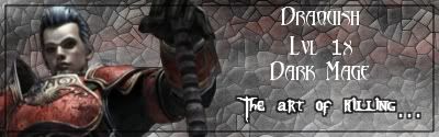


Dare i post more?O_o
well, great minds DO think alike
(i

my gunz sig ^_^)
Posted: Mon Oct 30, 2006 4:30 am
by Key-J
Lolz your sigs are cool, i think you could sprooce up ur Halo one tho.. It seems to be the black sheep of the rest..
Posted: Mon Oct 30, 2006 4:36 am
by Draquish
all i liek of it is the background...wich i made myself btw
Posted: Mon Oct 30, 2006 4:38 am
by Key-J
Yah dude,.. the background is awsome. But i would add to it.. i dono what. but something
Posted: Tue Oct 31, 2006 8:40 am
by Jetfire
i want to~~~~~~~~~ some 1 help me make 1 ^^
Posted: Tue Oct 31, 2006 2:09 pm
by Key-J
Well make a post.. Clearly describing what you desire and we will try to help you, and also you should probably read
This Post first before making your thread as in to make sure you get the best sig