Page 1 of 1
Missing Va Va Voom
Posted: Sat Oct 21, 2006 11:18 am
by [SD]Master_Wong
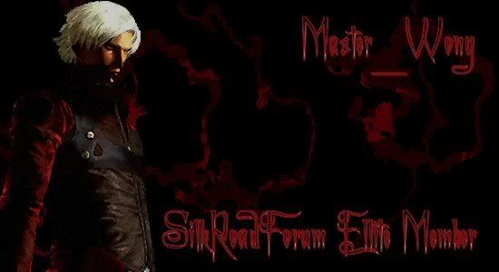
This is going to be my new sig as soon as i feel it is finished it has 6 layers
3 for the back ground
1 for the levels
1 for the charecter
1 for the text
im using paintshop pro 8 iv learn all this by my self no help so now im asking for help
this is it
 i also may make it smaller i think its too big to be a sig atm
Posted: Sat Oct 21, 2006 7:49 pm
by senapanaga
cool too dark imo but it seems like thats the kind of thing you're into

I likes it though

Posted: Sat Oct 21, 2006 8:10 pm
by CrimsonNuker
WOAH! its really dark! try making it lighter =)
Posted: Sat Oct 21, 2006 8:13 pm
by [SD]Master_Wong
Well its darkness is what i going for as Devil May Cry has this goti darkness theme to it so i though i like that and went for the same idea here...but something is lacking can anyone help?
Posted: Sun Oct 22, 2006 12:39 am
by Tatianasaphira
Try making the text a bright red, that way it stands out, and yeah shave it in half...
Posted: Sun Oct 22, 2006 12:47 am
by [SD]Master_Wong
ok il see what it looks like tomoz and post it
Posted: Sun Oct 22, 2006 8:11 am
by hangten1
Master_wong wrote:Well its darkness is what i going for as Devil May Cry has this goti darkness theme to it so i though i like that and went for the same idea here...but something is lacking can anyone help?
i think a boarder
i agree to all post
dmc is awesome

Posted: Sun Oct 22, 2006 9:53 am
by [SD]Master_Wong

unless you can find me a good boarder iv not added one..Text made lighter and iv made it smaller
Il up the quality when im gona use it for real but stil i feel like something is missing
Posted: Sun Oct 22, 2006 12:02 pm
by Tatianasaphira
Let me see what I can do with that...
Edit: Here ya go

Posted: Sun Oct 22, 2006 3:51 pm
by [SD]Master_Wong
Haha id like to se what you could do if you had the file for it haha your good
edit here i wanna see how good you can make it
Sig
Posted: Sun Oct 22, 2006 5:37 pm
by Caras
Umm its not bad, it is very dark and the text is kinda grungeish/hard to read, but I think thats what you wanted out of it. I guess you like the 'paint effect' like you have in your current sig. Makes it look like somthing somone painted.
Posted: Sun Oct 22, 2006 10:01 pm
by [SD]Master_Wong
i wanna have a go tomorrow at making the txt more clear
Posted: Sun Oct 22, 2006 11:02 pm
by Tatianasaphira
Hows this?

Posted: Sun Oct 22, 2006 11:26 pm
by [SD]Master_Wong

i envy you lol..stil gona use mine but thats soo much better
edit thats soo tempting...personal achivment is better (repeats in head)
Posted: Mon Oct 23, 2006 5:45 am
by Caras
Btw, what does missing va va voom mean?
Posted: Mon Oct 23, 2006 7:31 am
by Damad
It reminds me of something Yogi Bear would say.
Posted: Mon Oct 23, 2006 8:35 am
by [SD]Master_Wong
Caras wrote:Btw, what does missing va va voom mean?
missing something, dont stand out, dont have that flare