Page 1 of 1
My Newest Sig
Posted: Mon Sep 25, 2006 2:25 pm
by Kamoflage
I'd like to get your opinion on my new sig
I suck at adding text
Posted: Mon Sep 25, 2006 6:17 pm
by [SD]Kratos
Very nice, but yeah..the text is odd

Posted: Mon Sep 25, 2006 11:18 pm
by CrimsonNuker
colours....so nice...*drooling* my plasma screen kicks ass
umm yeah...its good
wanna gimmie some links for the tuts u followed? xP
Posted: Mon Sep 25, 2006 11:49 pm
by Caras
Yea its awesome.. If I didnt have a half ass ps I might be able to do somthing like that. Well.. mabye.
Posted: Tue Sep 26, 2006 8:09 am
by Kamoflage
CrimsonNuker wrote:colours....so nice...*drooling* my plasma screen kicks ass
umm yeah...its good
wanna gimmie some links for the tuts u followed? xP
I didnt follow any tuts

Posted: Tue Sep 26, 2006 7:51 pm
by CrimsonNuker
reeeaaaallly so u just play around till u find something that looks cool? xP
Posted: Wed Sep 27, 2006 8:11 am
by Kamoflage
Yep
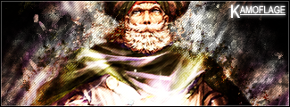
EDIT: Here's my even newer sig

Posted: Wed Sep 27, 2006 6:48 pm
by Bakemaster
Kamoflage wrote:CrimsonNuker wrote:colours....so nice...*drooling* my plasma screen kicks ass
umm yeah...its good
wanna gimmie some links for the tuts u followed? xP
I didnt follow any tuts

Posted: Wed Sep 27, 2006 7:06 pm
by [SD]Kratos
Kamoflage wrote:Yep
EDIT: Here's my even newer sig
a bit too much luminosity imo, and theres that black part on the left :S
Anyways, good sig, i like your works
Posted: Wed Sep 27, 2006 7:19 pm
by Moogie
I think the black space is juuust right. With the text there it balances the image perfectly IMO.

Great colours also. The contrast does wash out some of the details of the pic, but in this instance it looks more stylized than anything wrong. Kudos!
Posted: Wed Sep 27, 2006 7:47 pm
by CrimsonNuker
Moogie wrote:I think the black space is juuust right. With the text there it balances the image perfectly IMO.
Great colours also. The contrast does wash out some of the details of the pic, but in this instance it looks more stylized than anything wrong. Kudos!
Yep...thats how i like my sigs with a bit of space thats only black ^^
Posted: Wed Sep 27, 2006 8:59 pm
by Miyoko
A bit of emptyness is fine, but don't make that space tooooo empty (aka plain black
).
Fill it up with brushes or what ever, use colours that are soft to the eye, so you do see them, but they don't ruin the flow.
I personally think that signature needs some work though >.>
It's mainly a simple render on a black background without anything custom (or rarely).
This doesn't go for photomanip tho, that's all about trying to make something look good (or different). But instead you try to make it look as if it was supposed to be like that.
Like this:


But at the end it all comes down to personal taste, I know.
Greetz, Miyo
Posted: Wed Sep 27, 2006 9:17 pm
by spyropt
how i can put a image in forum..automaticly open not in a link????
Posted: Wed Sep 27, 2006 10:26 pm
by Bakemaster
Use the Img button in the reply box.
Posted: Thu Sep 28, 2006 10:28 am
by Kamoflage
Thanks for all the comments but I make sigs the way I like you make them the way you want.
Posted: Thu Sep 28, 2006 2:02 pm
by Moogie
You did ask us for our opinions.
Posted: Thu Sep 28, 2006 2:14 pm
by Kamoflage
Moogie wrote:You did ask us for our opinions.
Exactly why i said thanks
Posted: Thu Sep 28, 2006 2:23 pm
by FK47
Go easy on the contrast, there's a point where it changes from sharpened colours to an eyesore.