Page 1 of 1
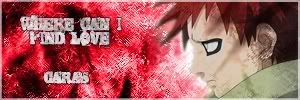
Another sig
Posted: Mon Sep 25, 2006 3:17 am
by Caras
No one seems to be posting in artist corner much anymore, so I guess I will.
Heres the 2 sigs I made today


Posted: Mon Sep 25, 2006 1:51 pm
by Moogie
For the "where can I find love" one, try pulling the character above the grunge layer so he looks clean.
The blue sig is very busy... I find it difficult to focus on any of it. Also the styles of the different characters don't match; the creatures have a somewhat realistic look, then you have a flat shaded animé character in between them, and again another differently shaded character to the side. This makes for a very disjointed feel, as none of their styles fit together.
I like that you're experimenting with text styles, positions, and fonts. Keep it up.

Posted: Mon Sep 25, 2006 11:23 pm
by CrimsonNuker
are you using gimp? cuz it seems like you have limited...access to more...ah i dont know...features?
Posted: Mon Sep 25, 2006 11:40 pm
by Caras
I have ps.. well half a ps. For some reason some tools are missing, I gotta install it from somwhere else another time..


