Page 1 of 1
new sig, thing xD
Posted: Mon Aug 07, 2006 11:35 pm
by Draquish
i jst saw some of the sigs u guys make.....im noewhere near that

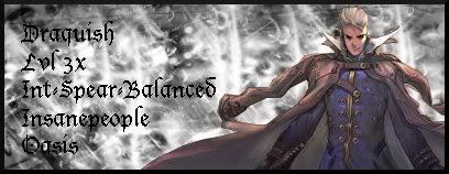
heres my newest sig,thing, that i made


Posted: Mon Aug 07, 2006 11:36 pm
by Suppaman
yeahhh i like it!
Posted: Mon Aug 07, 2006 11:37 pm
by Draquish
Posted: Mon Aug 07, 2006 11:47 pm
by NightShroud
It's awesome, go blur the black border on the guy a bit to blend it some.
Posted: Mon Aug 07, 2006 11:53 pm
by Nannari
Love the style, you should put ur name in it and use it.
Posted: Mon Aug 07, 2006 11:54 pm
by NightShroud
Umm..Who the hell voted 2/10?...They need a spoon to the heart.
Posted: Tue Aug 08, 2006 12:06 am
by pherball
LOl spoon to the heart.. no.
...
...
... Plastic forks to the testicles.
Anywho.. 10/10
TEACH ME...

No really.. Teach

Posted: Tue Aug 08, 2006 12:07 am
by CrimsonNuker
hey its pretty nice, but the background looks like its just a pattern =/
Posted: Tue Aug 08, 2006 2:14 am
by NightShroud
pherball wrote:LOl spoon to the heart.. no.
...
...
... Plastic forks to the testicles.
Anywho.. 10/10
TEACH ME...
No really.. Teach
LOL! Now that's just CRUEL Sonny.
Posted: Tue Aug 08, 2006 3:07 am
by Draquish
CrimsonNuker wrote:hey its pretty nice, but the background looks like its just a pattern =/
its not ^^
i alredy delelted teh original file >_> so i cant change the border

ill make a new1 with another thief dude
GIMP PWONS U ALL!
Posted: Tue Aug 08, 2006 3:19 am
by Rockshmo
Not bad. Background could use some more depth and maybe some color. Stock could be blended a bit more too.
Overall it's pretty nice. Are you gonna add text?
Posted: Tue Aug 08, 2006 3:24 am
by Draquish
Rockshmo wrote:Not bad. Background could use some more depth and maybe some color. Stock could be blended a bit more too.
Overall it's pretty nice. Are you gonna add text?
i tried to blend it more, but i just couldnt (told u i was a nooblet xD) ill try harder 2 blend next time

btw.....i and i was planing on adding text.....should i

Posted: Tue Aug 08, 2006 3:25 am
by NightShroud
Gimp is bad with text, you should let somebody else doez it.
Posted: Tue Aug 08, 2006 3:56 am
by CrimsonNuker
NightShroud wrote:Gimp is bad with text, you should let somebody else doez it.
i wouldnt mind doing it ^^, ill use my pwning Photoshop CS2 for ur txt just tell me how u like it and ill see what i can come up with ^^
Posted: Tue Aug 08, 2006 4:59 am
by zero510
My opinion, = 2/10. Try doing a 1 pixel Soft light or overlay border, use a variety of brushes and not the same. Do some text, black and white bg=not good looking, put some color into that... and that render in the middle is just another thing popping out. Basically you brushed, border, slapped on a render, finish.
Posted: Tue Aug 08, 2006 5:03 am
by NightShroud
zero510 wrote:My opinion, = 2/10. Try doing a 1 pixel Soft light or overlay border, use a variety of brushes and not the same. Do some text, black and white bg=not good looking, put some color into that... and that render in the middle is just another thing popping out. Basically you brushed, border, slapped on a render, finish.
Yes, and you've done so much with yours. He's using gimp, there aren't that many functions..Give him credit for a good looking sig, and what render isn't just popping out? -.-
Posted: Tue Aug 08, 2006 8:30 am
by Kamoflage
Posted: Tue Aug 08, 2006 1:24 pm
by Draquish
thx 4 all the good vibes guys
im really starting 2 liek making siggys
even though i still need to master the art of teh gimp
i still dont know how 2 color my background with my render without messing everything up
heres a new sig,thingy of mines(if any1s interested>_>)
Posted: Tue Aug 08, 2006 1:51 pm
by NightShroud
draquish wrote:thx 4 all the good vibes guys
im really starting 2 liek making siggys
even though i still need to master the art of teh gimp
i still dont know how 2 color my background with my render without messing everything up
heres a new sig,thingy of mines(if any1s interested>_>)
Here's a BIG hint, LAYERS. Color channel it later with layer 1 being grey background or whatever, layer 2 being any complex borders, layer 3 being render, and layer 4 being text.
Posted: Tue Aug 08, 2006 2:48 pm
by Draquish
NightShroud wrote:Here's a BIG hint, LAYERS. Color channel it later with layer 1 being grey background or whatever, layer 2 being any complex borders, layer 3 being render, and layer 4 being text.
thats EXACTLY how i did it -_- exept that the border is in the 4th layer along with the text.....is THAT the problem
Posted: Tue Aug 08, 2006 3:30 pm
by NightShroud
draquish wrote:NightShroud wrote:Here's a BIG hint, LAYERS. Color channel it later with layer 1 being grey background or whatever, layer 2 being any complex borders, layer 3 being render, and layer 4 being text.
thats EXACTLY how i did it -_- exept that the border is in the 4th layer along with the text.....is THAT the problem
Oh, Filters>Colors>Channel mixer.
Posted: Tue Aug 08, 2006 4:23 pm
by Draquish
*comes back* ok is THIS good enough
I did not get the font I wanted to get


Posted: Tue Aug 08, 2006 4:32 pm
by CrimsonNuker
Oh yeah thats muc much better *thumbs up*
OMFG YES THE FIXED THE .GIF PROBLEM NOW ALL ANIMATED SIGS WORK WOOOOT!!
Re: new sig, thing xD
Posted: Wed Jun 25, 2008 11:23 pm
by 0l3n
Like crim said, much better.
Re: new sig, thing xD
Posted: Wed Jun 25, 2008 11:26 pm
by Squirt
OMFG DRAQUISH MAKING SPELLING MISTAKES. SOMEONE SCREENSHOT THIS