new sig, thing xD

Digital art design, renderings, signatures and anything art related. Upload pictures of your newest work or ask for feedback. Post graphics requests or discuss art in general.
Post Reply

Rate it

10/10
9
39%
9/10
2
9%
8/10
2
9%
7/10
3
13%
6/10
2
9%
5/10
1
4%
4/10
2
9%
3/10
0
No votes
2/10
1
4%
1/10
1
4%
 
Total votes: 23

User avatar
Draquish
Elite Member
Posts: 6423
Joined: Wed Mar 15, 2006 10:25 pm
Quick Reply: Yes
Location: ____

new sig, thing xD

Post by Draquish »

i jst saw some of the sigs u guys make.....im noewhere near that :oops: 
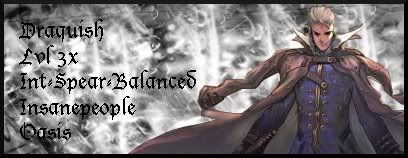
heres my newest sig,thing, that i made :D


Image

User avatar
Suppaman
Frequent Member
Posts: 1346
Joined: Sun Jun 04, 2006 1:14 am
Quick Reply: Yes
Location: Oasis

Post by Suppaman »

yeahhh i like it!

User avatar
Draquish
Elite Member
Posts: 6423
Joined: Wed Mar 15, 2006 10:25 pm
Quick Reply: Yes
Location: ____

Post by Draquish »

:D :D :D :D


YEYYYYY! :D :D 8) 8) 8)

NightShroud
Regular Member
Posts: 304
Joined: Thu Jul 20, 2006 5:18 pm
Quick Reply: Yes
Location: Olympus
Contact:

Post by NightShroud »

It's awesome, go blur the black border on the guy a bit to blend it some.
Image
Image
-|IGN:NightShroud - 18 | Guild: SellSwords|- Thanks to MapleShilc for animation.

User avatar
Nannari
Regular Member
Posts: 323
Joined: Sun Apr 16, 2006 4:28 pm
Quick Reply: Yes
Location: Odin

Post by Nannari »

Love the style, you should put ur name in it and use it.
Image

dom wrote: I never use more then 20~gb, and most of that is in porn alone.

NightShroud
Regular Member
Posts: 304
Joined: Thu Jul 20, 2006 5:18 pm
Quick Reply: Yes
Location: Olympus
Contact:

Post by NightShroud »

Umm..Who the hell voted 2/10?...They need a spoon to the heart.
Image
Image
-|IGN:NightShroud - 18 | Guild: SellSwords|- Thanks to MapleShilc for animation.

pherball
Valued Member
Posts: 398
Joined: Wed Jul 19, 2006 6:16 am
Quick Reply: Yes
Location: Xian

Post by pherball »

LOl spoon to the heart.. no.
...
...
... Plastic forks to the testicles.

Anywho.. 10/10
:D
TEACH ME... :)
No really.. Teach 8)
Image

User avatar
CrimsonNuker
Dom's Slut
Posts: 13791
Joined: Sun Aug 06, 2006 3:31 am
Quick Reply: Yes
Location: guildwars2

Post by CrimsonNuker »

hey its pretty nice, but the background looks like its just a pattern =/
ImageImageImage

NightShroud
Regular Member
Posts: 304
Joined: Thu Jul 20, 2006 5:18 pm
Quick Reply: Yes
Location: Olympus
Contact:

Post by NightShroud »

pherball wrote:LOl spoon to the heart.. no.
...
...
... Plastic forks to the testicles.

Anywho.. 10/10
:D
TEACH ME... :)
No really.. Teach 8)


LOL! Now that's just CRUEL Sonny.
Image
Image
-|IGN:NightShroud - 18 | Guild: SellSwords|- Thanks to MapleShilc for animation.

User avatar
Draquish
Elite Member
Posts: 6423
Joined: Wed Mar 15, 2006 10:25 pm
Quick Reply: Yes
Location: ____

Post by Draquish »

CrimsonNuker wrote:hey its pretty nice, but the background looks like its just a pattern =/


its not ^^


i alredy delelted teh original file >_> so i cant change the border :( ill make a new1 with another thief dude :D GIMP PWONS U ALL! :D 8)

User avatar
Rockshmo
Frequent Member
Posts: 1062
Joined: Mon May 29, 2006 5:00 pm
Quick Reply: Yes
Location: rehab
Contact:

Post by Rockshmo »

Not bad. Background could use some more depth and maybe some color. Stock could be blended a bit more too.

Overall it's pretty nice. Are you gonna add text?
Image
[Sparta][Pure STR][Lvl 5x]

User avatar
Draquish
Elite Member
Posts: 6423
Joined: Wed Mar 15, 2006 10:25 pm
Quick Reply: Yes
Location: ____

Post by Draquish »

Rockshmo wrote:Not bad. Background could use some more depth and maybe some color. Stock could be blended a bit more too.

Overall it's pretty nice. Are you gonna add text?


i tried to blend it more, but i just couldnt (told u i was a nooblet xD) ill try harder 2 blend next time :banghead: btw.....i and i was planing on adding text.....should i :?

NightShroud
Regular Member
Posts: 304
Joined: Thu Jul 20, 2006 5:18 pm
Quick Reply: Yes
Location: Olympus
Contact:

Post by NightShroud »

Gimp is bad with text, you should let somebody else doez it.
Image
Image
-|IGN:NightShroud - 18 | Guild: SellSwords|- Thanks to MapleShilc for animation.

User avatar
CrimsonNuker
Dom's Slut
Posts: 13791
Joined: Sun Aug 06, 2006 3:31 am
Quick Reply: Yes
Location: guildwars2

Post by CrimsonNuker »

NightShroud wrote:Gimp is bad with text, you should let somebody else doez it.


i wouldnt mind doing it ^^, ill use my pwning Photoshop CS2 for ur txt just tell me how u like it and ill see what i can come up with ^^
ImageImageImage

zero510
Common Member
Posts: 130
Joined: Wed Mar 08, 2006 4:33 am
Quick Reply: Yes
Contact:

Post by zero510 »

My opinion, = 2/10. Try doing a 1 pixel Soft light or overlay border, use a variety of brushes and not the same. Do some text, black and white bg=not good looking, put some color into that... and that render in the middle is just another thing popping out. Basically you brushed, border, slapped on a render, finish.

NightShroud
Regular Member
Posts: 304
Joined: Thu Jul 20, 2006 5:18 pm
Quick Reply: Yes
Location: Olympus
Contact:

Post by NightShroud »

zero510 wrote:My opinion, = 2/10. Try doing a 1 pixel Soft light or overlay border, use a variety of brushes and not the same. Do some text, black and white bg=not good looking, put some color into that... and that render in the middle is just another thing popping out. Basically you brushed, border, slapped on a render, finish.


Yes, and you've done so much with yours. He's using gimp, there aren't that many functions..Give him credit for a good looking sig, and what render isn't just popping out? -.-
Image
Image
-|IGN:NightShroud - 18 | Guild: SellSwords|- Thanks to MapleShilc for animation.

Kamoflage
Common Member
Posts: 133
Joined: Mon Jul 10, 2006 10:45 am
Quick Reply: Yes
Location: Oasis

Post by Kamoflage »

Image

User avatar
Draquish
Elite Member
Posts: 6423
Joined: Wed Mar 15, 2006 10:25 pm
Quick Reply: Yes
Location: ____

Post by Draquish »

thx 4 all the good vibes guys :D im really starting 2 liek making siggys :)
even though i still need to master the art of teh gimp :banghead: i still dont know how 2 color my background with my render without messing everything up :banghead: heres a new sig,thingy of mines(if any1s interested>_>)

Image

NightShroud
Regular Member
Posts: 304
Joined: Thu Jul 20, 2006 5:18 pm
Quick Reply: Yes
Location: Olympus
Contact:

Post by NightShroud »

draquish wrote:thx 4 all the good vibes guys :D im really starting 2 liek making siggys :)
even though i still need to master the art of teh gimp :banghead: i still dont know how 2 color my background with my render without messing everything up :banghead: heres a new sig,thingy of mines(if any1s interested>_>)

Image


Here's a BIG hint, LAYERS. Color channel it later with layer 1 being grey background or whatever, layer 2 being any complex borders, layer 3 being render, and layer 4 being text.
Image
Image
-|IGN:NightShroud - 18 | Guild: SellSwords|- Thanks to MapleShilc for animation.

User avatar
Draquish
Elite Member
Posts: 6423
Joined: Wed Mar 15, 2006 10:25 pm
Quick Reply: Yes
Location: ____

Post by Draquish »

NightShroud wrote:Here's a BIG hint, LAYERS. Color channel it later with layer 1 being grey background or whatever, layer 2 being any complex borders, layer 3 being render, and layer 4 being text.


thats EXACTLY how i did it -_- exept that the border is in the 4th layer along with the text.....is THAT the problem :?

NightShroud
Regular Member
Posts: 304
Joined: Thu Jul 20, 2006 5:18 pm
Quick Reply: Yes
Location: Olympus
Contact:

Post by NightShroud »

draquish wrote:
NightShroud wrote:Here's a BIG hint, LAYERS. Color channel it later with layer 1 being grey background or whatever, layer 2 being any complex borders, layer 3 being render, and layer 4 being text.


thats EXACTLY how i did it -_- exept that the border is in the 4th layer along with the text.....is THAT the problem :?


Oh, Filters>Colors>Channel mixer.
Image
Image
-|IGN:NightShroud - 18 | Guild: SellSwords|- Thanks to MapleShilc for animation.

User avatar
Draquish
Elite Member
Posts: 6423
Joined: Wed Mar 15, 2006 10:25 pm
Quick Reply: Yes
Location: ____

Post by Draquish »

*comes back* ok is THIS good enough :? I did not get the font I wanted to get :roll:


Image
Last edited by Draquish on Wed Jun 25, 2008 11:28 pm, edited 2 times in total.

User avatar
CrimsonNuker
Dom's Slut
Posts: 13791
Joined: Sun Aug 06, 2006 3:31 am
Quick Reply: Yes
Location: guildwars2

Post by CrimsonNuker »

Oh yeah thats muc much better *thumbs up*


OMFG YES THE FIXED THE .GIF PROBLEM NOW ALL ANIMATED SIGS WORK WOOOOT!!
ImageImageImage

User avatar
0l3n
Elite Member
Posts: 5184
Joined: Fri Jun 16, 2006 1:45 pm
Quick Reply: Yes
Location: Artists Corner

Re: new sig, thing xD

Post by 0l3n »

Like crim said, much better.
Image
Image

User avatar
Squirt
Forum God
Posts: 8186
Joined: Sat Jan 05, 2008 9:48 pm
Quick Reply: Yes
Location: Off Topic

Re: new sig, thing xD

Post by Squirt »

OMFG DRAQUISH MAKING SPELLING MISTAKES. SOMEONE SCREENSHOT THIS
Image
Spoiler!

woutR wrote:Squirt, you're a genius when it comes to raping women.

Post Reply

Return to “Artists Corner”