Page 1 of 1
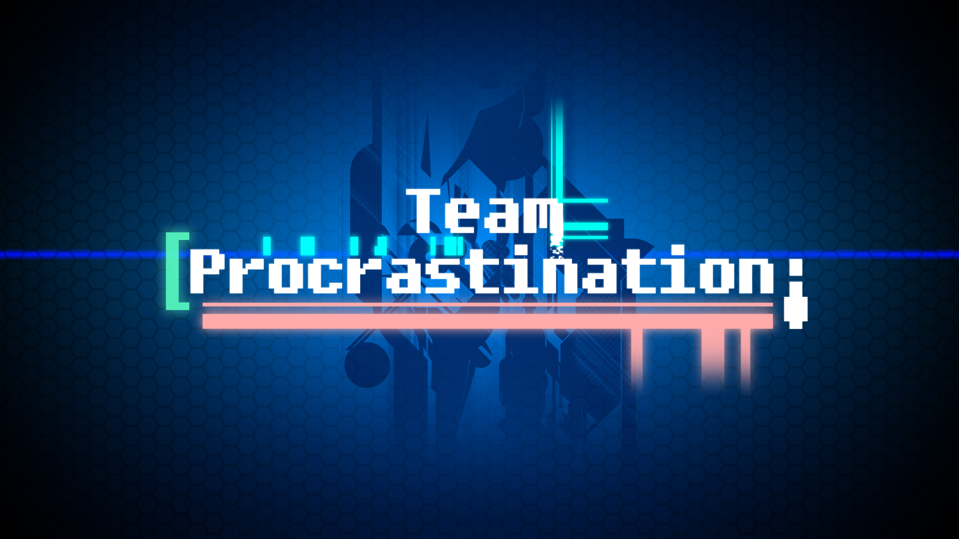
Team Procrastination logo!
Posted: Sun Sep 18, 2011 10:11 am
by poehalcho
BEHOLD! The logo for my someday to be game development company/tv station/new world order/arcade/radio!

And it's wallpaper size no less

full download pack with 1920x1200 and 1600x900 available
here (not that anybody cares -.-)
And it's entirely non-vectored so I'll have to completely remake it in a few years


C&C please
Re: Team Procrastination logo!
Posted: Sun Sep 18, 2011 2:32 pm
by Scarth
AC has been through this more then once, that's not a logo. A logo is something compact and easy to use, and, more importantly, easy to recognize. This is more or less a bit-style text on a background.
Other then that, it looks very nice.

Re: Team Procrastination logo!
Posted: Sun Sep 18, 2011 2:56 pm
by poehalcho
Thank you

,
I was thinking of making a compact version as well, this is more like the thing you put at the front of the main office (not a logo?)

.
Meanwhile I've been thinking of a few improvements for this version. I'm considering changing the pink bar's light settings to screen or hard light so it becomes a little transparent. Something about the text is bothering me as well, I'm think of giving it one of those triple coloured borders in green/red/blue, like it's getting warped, but I'm worried if it's not gonna be too much stuff. Is there any special trick to making one of those borders?
BTW if anyone would like a textless version, please tell me. I'll upload one

Re: Team Procrastination logo!
Posted: Sun Sep 18, 2011 7:26 pm
by Scarth
To help emphasize my point:
These are logo'sCompact, clear and when you learn to know what it is, very recognizable.
Taking your.. let's call it a wallpaper for now, as an example, an easy way to make a logo of it would be to take the T from Team and the P from Procrastination, and working that into something more compact on the same background. Add brackets like the green one you've got at the left side of the P, and perhaps a line underneath like the orange/brown one under procrastination, and you've got yourself something more of a logo.
This is more a good start then a finished logo. Don't be discouraged though, please. It does look very well, and could probably be used as a solid base for the actual logo.

Re: Team Procrastination logo!
Posted: Wed Sep 28, 2011 10:00 pm
by Shomari
yeah logos are a hard thing to deal with.
just research more on logos and the design process.


