Digital art design, renderings, signatures and anything art related. Upload pictures of your newest work or ask for feedback. Post graphics requests or discuss art in general.
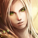
I like the backround but not the dude heh... He dosen't fit there imo... I would put gradient maps on there to blend him in or something... but that's just me not really useful at giving c&c Anyways kiu
chrisorg wrote:I like the backround but not the dude heh... He dosen't fit there imo... I would put gradient maps on there to blend him in or something... but that's just me not really useful at giving c&c Anyways kiu
I'm working on making an avatar like yours and Shomari. Pen Tool + Brushes?
I've been playing wow and black ops recently. I got on hon yesterday, had some good games. My school starts soon, so won't be able to play heaps anymore. >:( Oh yeah, I haven't started my holiday homework yet. hehe.
Shomari wrote:Splatters dont fit imo. guy looks like he half belongs there. I'd make the light wrap around slightly w/ a short falloff. kiu
They're astroids
The reason they just appear to be splatters is because they aren't prominent in the sig, they also end a bit abruptly as if it were a splatter. Incorporate some of them to the foreground, I find myself saying that too much. A foreground is just as important as the background.


not really useful at giving c&c