Bioshock Bigdaddy CnC
Posted: Wed Jul 14, 2010 6:58 pm
Well first, Exsoldier's big sister inspired me  . and well CnC and thanks for the information.
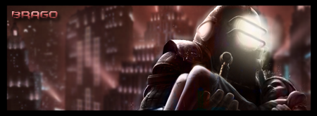
I was going for a feel to where the big daddy is taking the last little sister away from rapture, because the city is being destroyed (thus its red instead of the blue)
Version 1: Border + Name + Bigdaddy/little sister has the glow of the city being destroyed
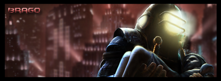
Version 2: Border + name
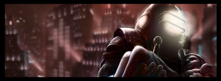
Version 3: Border
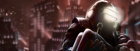
Version 4: No border
again thanks for the comments about it.
I was going for a feel to where the big daddy is taking the last little sister away from rapture, because the city is being destroyed (thus its red instead of the blue)
Version 1: Border + Name + Bigdaddy/little sister has the glow of the city being destroyed
Version 2: Border + name
Version 3: Border
Version 4: No border
again thanks for the comments about it.