Page 1 of 1
NSR~Smoking is Bad
Posted: Sun Jan 03, 2010 5:20 pm
by Deadsolid

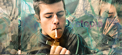
CnC plz
Re: NSR~Smoking is Bad
Posted: Sun Jan 03, 2010 7:17 pm
by Priam
So smoking is bad, but you're marketing it with fluffy happy bright colors?
Re: NSR~Smoking is Bad
Posted: Sun Jan 03, 2010 7:19 pm
by TheKnight
you surely do know how to use ripple

The thing that is most annoying for me, is that there is so many colors, Blue, teal, Pink, Green, Yellow, White, Black...
but thats not bad, haven't seen sigs from you for a long time
Edit: And those + marks doesn't make it look like bad thing -.-'
Re: NSR~Smoking is Bad
Posted: Sun Jan 03, 2010 8:18 pm
by Deadsolid
Priam wrote:So smoking is bad, but you're marketing it with fluffy happy bright colors?
I considered throwing in a few stuffed animals and teletubbys for good measure, but decided against it. I have figured that I need to start spending a ton more time per sig. My touch has pretty much gone.
Re: NSR~Smoking is Bad
Posted: Mon Jan 04, 2010 3:25 am
by inky
Good but could really use a revisit. The paint spatters and the text is just too bright and rigid - they don't blend in well with the rest of the image. Personally I'd suggest a gradient map but that's all up to you.
Re: NSR~Smoking is Bad
Posted: Mon Jan 04, 2010 9:07 am
by BrokenSaint
You should work on the color choice, saturated
Re: NSR~Smoking is Bad
Posted: Mon Jan 04, 2010 12:29 pm
by Crowley
Smoking is cool
Re: NSR~Smoking is Bad
Posted: Mon Jan 04, 2010 5:34 pm
by 0l3n
Kinda agree with Priam, not the greatest color choice.
More to the point, the ripple effect just kills it. Text and splatter looks decent though.
Re: NSR~Smoking is Bad
Posted: Mon Jan 04, 2010 8:16 pm
by Melez
Too much ripple indeed, that's the biggest problem in here imo
Re: NSR~Smoking is Bad
Posted: Fri Jan 08, 2010 2:48 am
by Dystopia
I not a fan of the next, and the splat doesn't mix to well the the ripple effect. It is good other than that...
Nice stock btw

(ancient)