Digital art design, renderings, signatures and anything art related. Upload pictures of your newest work or ask for feedback. Post graphics requests or discuss art in general.
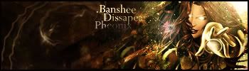
Have used the same render so i am familiar with it, and I like what you did with it. I'd agree that the left needs more work where as the right looks great. I like the text except in the word Phoenix. The black of the background hits it in a weird way because of the opacity. Just doesnt look right to me, I'd maybe fix that and it might help it. But nice job.
yea the background did look awkward, but I think it would just be better if I didn't place it like that. In that position the background's flow is contrary to the focal's flow. Why didn't I see this


 [Scoundrels]