Page 1 of 1
NSR ~ Greed
Posted: Wed Jul 01, 2009 3:01 am
by Sae
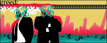
Been on a roll with these sigs >.> Feel like I could do more with this, but I'm outta ideas.
v2: tried to put perspective on the $$ and moved the text (even though I think it works in the corner, supposed to be like a definition)

v3: no text
Re: NSR ~ Greed
Posted: Wed Jul 01, 2009 6:13 am
by Nantosh
To me... to me it look LQ...
The idea is nice, but compared to the sig your using now? Hmm...
Re: NSR ~ Greed
Posted: Wed Jul 01, 2009 7:25 am
by Priam
It's not looking LQ, it's a way different style.
A style which i like, tbh.
Re: NSR ~ Greed
Posted: Wed Jul 01, 2009 8:44 am
by Kraq
It looks amazing, very unique.
The buildings in the back look awesome. If you were going for buildings, awesome job.
Re: NSR ~ Greed
Posted: Wed Jul 01, 2009 10:55 am
by BrokenSaint
I'd like to see this on a larger canvas, it has potential IMO.
Re: NSR ~ Greed
Posted: Wed Jul 01, 2009 2:14 pm
by Kirkaldi
Looks great, nice scribbling style for the buildings.
Re: NSR ~ Greed
Posted: Wed Jul 01, 2009 4:33 pm
by CrimsonNuker
CORNER TEXT >_<
Re: NSR ~ Greed
Posted: Wed Jul 01, 2009 4:36 pm
by cin
the only thing i mildly dislike is that the $$ on
the left guy aren't in any perspective, but just
rotated. idk how it would look if they would like
fade to the back instead of just being rotated,
but who knows, it might be easy to try?
Re: NSR ~ Greed
Posted: Wed Jul 01, 2009 4:41 pm
by hitokiri
Yeah i'd take the text out of the corner and try skewing the $$ on the left dudes head to see if you can get more of the perspective cin is talkin about.
I like it because its a diff style and it has a lot of meaning behind it.
Re: NSR ~ Greed
Posted: Wed Jul 01, 2009 5:58 pm
by Mirosuke
BrokenSaint wrote:I'd like to see this on a larger canvas, it has potential IMO.
Esto.
Re: NSR ~ Greed
Posted: Wed Jul 01, 2009 6:48 pm
by Sae
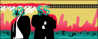
Thanks for the comments guys. I put two other versions up.
Re: NSR ~ Greed
Posted: Wed Jul 01, 2009 7:37 pm
by Kraq
Looks good. You can also try using the Perspective tool(?).
Re: NSR ~ Greed
Posted: Wed Jul 01, 2009 7:47 pm
by Sae
I just used perspective under transform. Is that it? I only have CS, so I don't have a lot of the newer stuff.
Re: NSR ~ Greed
Posted: Wed Jul 01, 2009 7:51 pm
by Kraq
Sae wrote:I just used perspective under transform. Is that it? I only have CS, so I don't have a lot of the newer stuff.
Yeah lol
To me it looks like you selected one of the money signs and made it smaller and placed it.
Re: NSR ~ Greed
Posted: Wed Jul 01, 2009 7:56 pm
by hitokiri
yeah, it was better in the corner if thats your goal, definition. I can see that. Id not shove it like that. has no space between it and the end of the signature. Try movin it over some.
And i was usin Skew yesterday, might work for it. Its a tough perspective to get though, that angle and have it look right with a 2d thing like the $ sign.
Re: NSR ~ Greed
Posted: Wed Jul 01, 2009 8:00 pm
by Kraq
lulull
Okay I tryed it and it is exactly like the perspective in your sig, so nevermind.

Re: NSR ~ Greed
Posted: Wed Jul 01, 2009 10:10 pm
by cin
with changing the perspective of the dollar signs
on the left person, try the regular transform, then
ctrl+drag the corners/sides.
but idk if you're still gonna bother putting up new
versions of the tag since you already have 3 now

and in this tag, i liked the text in the corner. but
maybe try out some different fonts, maybe a cleaner
font that makes it more part of the vector-look you
have achieved with the rest of the tag :]