Digital art design, renderings, signatures and anything art related. Upload pictures of your newest work or ask for feedback. Post graphics requests or discuss art in general.
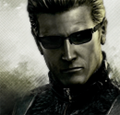
Only thing bothering me is the effects behind him. Seems like you got a fractal and put it on "Difference" Goes off from the colors you already have there.
I like V2 best, personally I'd have picked a different background, but overall, very good job.
+1 The background seems a little off for me also...but the effects around him look great. I think the text might be ok if it were smaller. V3 is my favorite though. The contrasts look nice in BW.
Kraq wrote:Looks very nice, has a soft feel to it.
Only thing bothering me is the effects behind him. Seems like you got a fractal and put it on "Difference" Goes off from the colors you already have there.