Page 1 of 1
nsr..
Posted: Sat Jan 24, 2009 11:18 pm
by Melez

Didn't do 1 in a while, but not very satisfied with the result.
C'n'C please, how to make it better and stuff.
EDIT:
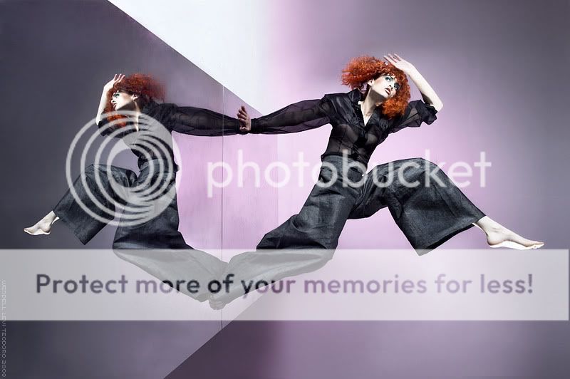
stock image
Re: nsr..
Posted: Sat Jan 24, 2009 11:55 pm
by CrimsonNuker
EDGE TEXT!
Re: nsr..
Posted: Sun Jan 25, 2009 12:08 am
by Kirkaldi
5/10 -_-
Re: nsr..
Posted: Sun Jan 25, 2009 12:28 pm
by Melez
Remove the text?
Re: nsr..
Posted: Sun Jan 25, 2009 3:09 pm
by CrimsonNuker
No, it makes the sig look unique
Re: nsr..
Posted: Sun Jan 25, 2009 3:16 pm
by Melez
lol.. serious, what to change/improve?
Re: nsr..
Posted: Sun Jan 25, 2009 3:20 pm
by !G4!
i think its fine but something does'nt feel right show cin
he can spot the missings ^_~
Re: nsr..
Posted: Sun Jan 25, 2009 4:02 pm
by jeansl10
7/10
the elbow is over-blurred imo
Re: nsr..
Posted: Sun Jan 25, 2009 4:42 pm
by Kraq
CrimsonNuker wrote:No, it makes the sig look unique
Yeah it does, I really like that kind of text placement just put it more to the left
so it kinda flows with the render. Right now it is too far in to the head so it kinda looks meh.
Re: nsr..
Posted: Tue Jan 27, 2009 6:23 pm
by Ploxy
4.5/10 from me
