Digital art design, renderings, signatures and anything art related. Upload pictures of your newest work or ask for feedback. Post graphics requests or discuss art in general.
Nice sig but like everyone else has mentioned your light source is a little distracting. I forgot who once told me this but they said " never place your light source coming from an exact corner, especially if there is going to be little to none fx around it". I've always kept those words in mind since then when ever I'm working on anything. Plus like Kraq said the light source is totally coming from the wrong side. Look at your stocks face the light is shining from the opp. side. Gotta pay attention to little things like that. Also I don't know why you keep doing this but that one single strand of clipping mask doesn't add to your sig. It just doesn't go well with the rest of the composition or concept.
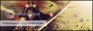
Hostage wrote: Also I don't know why you keep doing this but that one single strand of clipping mask doesn't add to your sig. It just doesn't go well with the rest of the composition or concept.
+1 Also, probably just me overlooking it,but it seems two flows are colliding.
The renders flow is represented by the red arrow and the light source flow is represented by the blue arrow.
No I was talking about this;
Even this is acceptable in my eyes because in essence they are parallel so they don't disrupt the movement of flow much. To be dreadfully honest he hasn't done to much in the first place to add flow and also lighting has very little to nothing to do with your flow. It is there more to help increase the depth of your piece. Only reason we see it used to make flow in the AC is because a lot of us still use the soft brush technique to add lighting which is not really the best way to do it.
Ok, it is most likely pentool he used to make a the initial shape but he put a clipping mask over it. Also it's the only clipping mask I see. It's just there no real reason, just there. Hence why I said it doesn't seem to be adding a purpose to your sig it seems lonely and unneeded.
however, i think that Melez style is cool, but his sigs tend to look a bit confusing to me O.o i think it's cause of the unnecessary things you add sometimes (to not go completly offtopic)
Hostage wrote:Only reason we see it used to make flow in the AC is because a lot of us still use the soft brush technique to add lighting which is not really the best way to do it.
It's kinda hard to explain in one sitting you learn over time the more you play with PS. Some tips that people have told me are to work more on the render itself then just simply brushing near it. Give the illusion from where the light is coming from by working it in layer by layer. Rather then trying to force in a light source by adding a huge white brush mark in a corner or something. My best example is this sig. Most of you guys have seen the original from that competition Barotix had so you can compare the two. You can see where I worked in the lighting on the render it's self as well. The circled areas are my light source. They're light shining threw windows on buildings or what ever you can imagine it to be. It's something that makes sense, something that you can say yes to "..it does make sense fro light to be coming from there". Now I notice this is a bit more of a "realism" tag and not all sigs have buildings to to make source from. Just remember where would it make sense to have the light source come from.
Last edited by Hostage on Sun Oct 19, 2008 11:37 pm, edited 2 times in total.
CrimsonNuker wrote:Actually...i found the stock while i was googling some 4chan shit lol
Rofl. I found it here, "cool pix thread" in off topic lol.
Also, Hostage, I know, but that place would be just empty.. Now I see that I shouldn't have put it there.. And its a layer mask (hide all), lasso tool and white brush. And.. Tell me.. Any other way of making a light source? The 100pxl soft brush is the only way I know..


 The renders flow is represented by the red arrow and the light source flow is represented by the blue arrow.


