Page 1 of 1
NsR ~ Grow your angel wings
Posted: Fri Oct 17, 2008 9:56 pm
by Melez
Well, was saving it for the competition, if it is gonna be sprites, but wanted to see some basic opinions first.
Tut followed.
C'n'C/rate.
Re: NsR ~ Grow your angel wings
Posted: Fri Oct 17, 2008 9:59 pm
by Kirkaldi
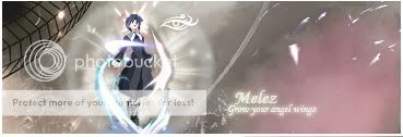
lol new sig again? render is way too small.
7/10
Re: NsR ~ Grow your angel wings
Posted: Fri Oct 17, 2008 10:13 pm
by Swindler
Kirkaldi wrote:lol new sig again? render is way too small.
7/10
its a sprite sig so renders is mostly of the time pretty small.
I like it, luv the effects you did around the render, and when i first looked at the wireframe it seemed out of place. But now i really like it there. Looks like a spaceship.
Only thing I dont really like is the text.
KIU m8

Re: NsR ~ Grow your angel wings
Posted: Fri Oct 17, 2008 10:19 pm
by IceCrash
nice job Melez, yeah, i think the text's a little bit off, dun like the glow.
I think that if you're working on a sig, the text's best to be simple, no outer glows or big shadows or stuff like that you know what i mean? (in my opinion)
You know that stripe in the middle of the sig?
From the to the left, i think you did an AMAZING, seriously, and AMAZING job, but i don't like it from the to the right, i think that maybe it would of been better if you either add another thingy like the one on the top left or if you didnt add the pink thingy and made it sorta like the sig was fading away into th darkness or something like that, idk, im tired and sleepy so yeah

but still 8.5/10 KIU
Re: NsR ~ Grow your angel wings
Posted: Sat Oct 18, 2008 1:42 am
by Kraq
Your really doing well, like how the feeling i get is that like the sprite is having a struggle and it looks good ^-^
8/10
Re: NsR ~ Grow your angel wings
Posted: Sat Oct 18, 2008 4:08 am
by Hostage
Ahhh, the Ryu tut David did an awesome job on that. If you follow it all the way through you will learn a lot. Good choice.
your wirefram looks off because of how dark it is and the brownish colour it's retaining. Just doesn't seem like it's part of the sigs, just something that was thrown in. Nice choice of sprite aswell it has incredible potential to add so much flow I'm interested to see in what direction you'll be taking it ( unless this is the finished copy?). I can see why you would place your text there to fill up the space but I think you should come up with a plan B and try something else to fill the tag up and move the text closer to your sprite or scrap it. Anywho, wouldn't call it a finished product but definitely an awesome start. Keep going at it.
Re: NsR ~ Grow your angel wings
Posted: Sat Oct 18, 2008 7:44 am
by Melez
@Ice: Rofl, funny c'n'c, thanks.
@Hostage: Isn't a finished copy. Any suggestion what should I fill it with?
@all: Thanks.
Re: NsR ~ Grow your angel wings
Posted: Mon Oct 20, 2008 7:58 am
by rek
The text is too far away from the sprite, creates a seperate focal. kiu